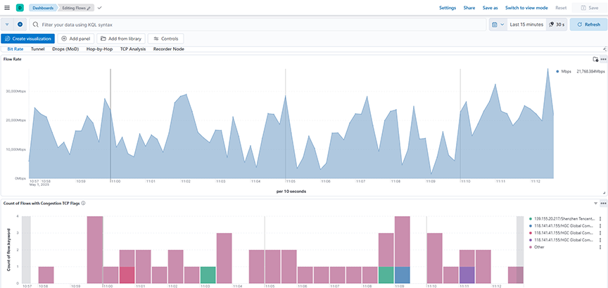
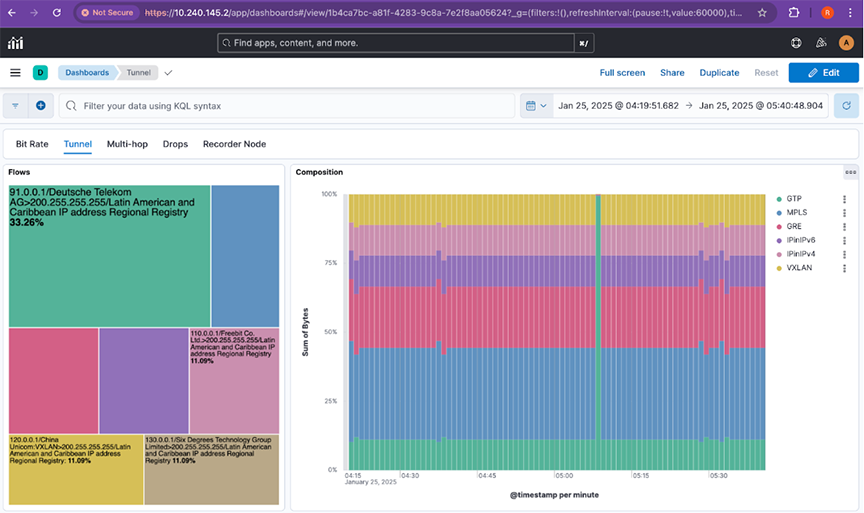
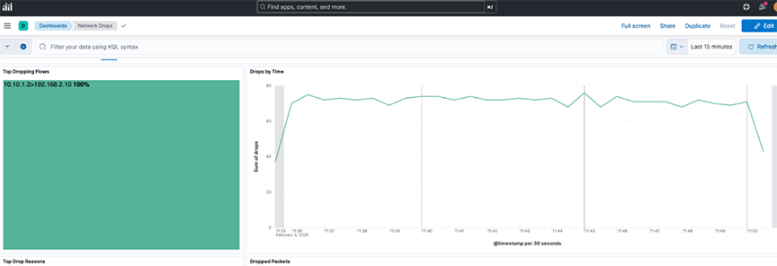
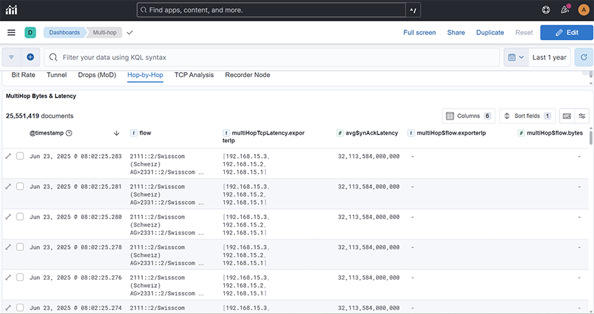
DMF

This chapter describes uses the dashboards on the DMF tab to monitor activity on the DANZ Monitoring Fabric Controller. It includes the following sections.
Note: Information displayed on these dashboards requires configuring an ACL for Redis and replicated Redis using the Analytics CLI after first boot configuration.

Policy

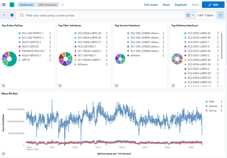
The DMF → Policy dashboard summarizes information about DANZ Monitoring Fabric policy activity and provides the following panels:

  • Top Active Policies: Displays the top active policies based on the sum of bit rates over a selected time range, helping identify which policies contribute the most to traffic.
  • Top Filter Interfaces: Displays the top filter interfaces based on the sum of bit rates over a selected time range, allowing identification of interfaces handling the most traffic.
  • Top Service Interfaces: Displays the top service interfaces based on the sum of bit rates over a selected time range, highlighting which service interfaces handle the most traffic.
  • Top Delivery Interfaces: Displays the top delivery interfaces based on the sum of bit rates over a selected time range, helping to identify which interfaces are handling the most traffic for policy delivery.
  • Mean Bit Rate: Shows the mean bit rate over a selected time range by summing bit rates across different policy types (filter, delivery, and service) and plotting the values against time.
Figure 1. DMF > Policy Dashboard - Top
The middle dashboard includes:
  • Mean Packet Rate: Shows the mean packet rate over a selected time range by summing packet rates across different policy types (filter, delivery, and service) and plotting the values against time.
  • Core Device: Shows the distribution of bit rate across core devices over a selected time range, with data aggregated by device alias names and ordered by the total sum of bit rate.
  • Policy Core Interface Bit Rate: Shows the sum of bit rates over time for core interfaces related to policy traffic, aggregated by timestamp over a selected time range.
  • Core Interface: Shows the distribution of bit rate across core interfaces over a selected time range, with data aggregated by interface names and ordered by the total sum of bit rate.
  • Policy Core Interface Packet Rate: Shows the sum of packet rates over time for core interfaces associated with policy traffic, aggregated by timestamp over a selected time range.
Figure 2. DMF > Policy Dashboard - Middle
The lower dashboard includes:
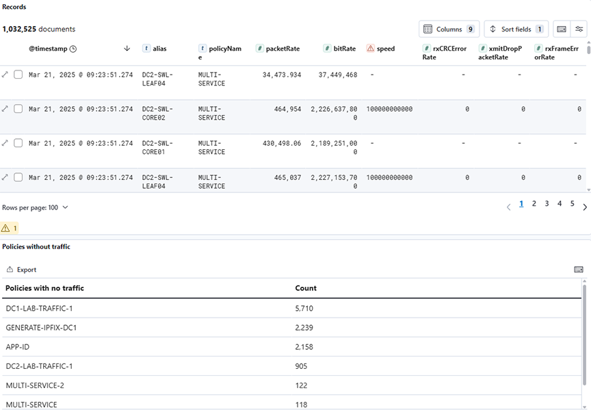
  • Records: Displays detailed raw records of policy-related statistics across various types over a selected time range, including metadata fields such as timestamps, types, bit rates, and packet counts.
  • Policies with no traffic: Lists policies with zero traffic by counting occurrences of policy names where the bit rate is zero, aggregated over a selected time range.
Figure 3. DMF > Policy Dashboard - Bottom

Use the Top Active Policies visualization to verify that your DANZ Monitoring Fabric policies are active and behaving as expected.

Use the Filter Interfaces visualization to balance the utilization of your filter interfaces and ensure that it doesn't drop any packets to analyze.

Interface

Click the DMF → Interface tab to display the following dashboard.

  • Interface Type: Displays the distribution of interface types by summing the bit rate for each type over a selected time range.
  • SVC-Del-Filter IF: Displays the distribution of traffic across different service, delivery, and filter interfaces by summing the bit rate for each interface over a selected time range.
  • Core Service (IF): Displays the sum of transmitted bit rates (txBitRate) for different core device interfaces over a selected time range.
  • Core IF: Displays the sum of transmitted bit rates (txBitRate) across core interfaces, grouped by interface name, over a selected time range.
Figure 4. DMF > Interface Dashboard - Top
The lower dashboard includes:
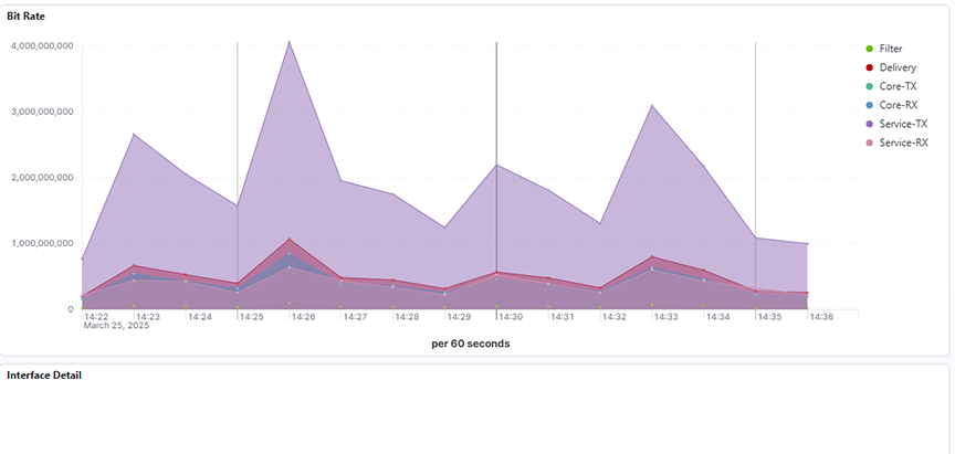
  • Bit Rate: Displays the average bit rates for filter, delivery, core transmit (TX), core receive (RX), service transmit (TX), and service receive (RX) interfaces over a selected time range.
  • Interface Detail: Displays detailed interface metrics, including bit rate, packet count, error rates, and other network statistics over a selected time range.
Figure 5. DMF > Interface Dashboard - Bottom

SN (Service Node)

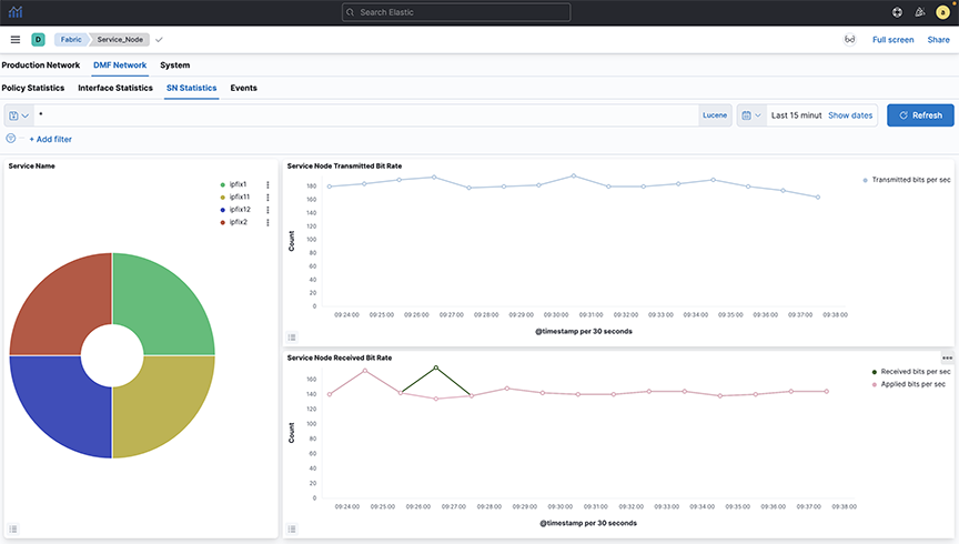
Click the DMF → SN tab to display the following panels:

  • Service Name: Displays the count of records grouped by service name over a selected time range.
  • Service Node Transmitted Bit Rate: Displays service nodes' average transmitted bit rate per second over a selected time range.
  • Service Node Received Bit Rate: Displays the average received and applied bit rates per second for service nodes over a selected time range.
Figure 6. DMF > SN Dashboard

Select a service from the pie chart to see the statistics for a specific managed service. It will display statistics for the selected service.

Events

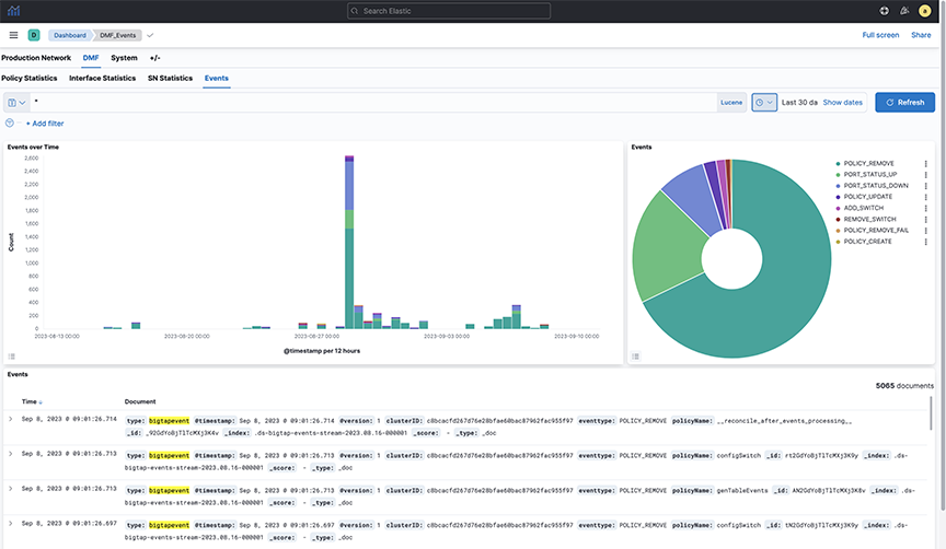
The DMF → Events dashboard summarizes information about DANZ Monitoring Fabric management network events and provides the following panels:

  • Events Over Time: Displays the count of different event types over a selected time range using a date histogram on the timestamp field.
  • Events: Displays the count of different event types over a selected time range, based on the eventtype.keyword field.
  • Events: Displays a timeline of bigTapevent records, showing the distribution of different event types and their details over a selected time range.
Figure 7. DMF > Events Dashboard

Production

This chapter describes the dashboards provided on the Production Network tab, which shows traffic and events on the production network interfaces connected to the DANZ Monitoring Fabric. This section includes the following sections:

sFlow®

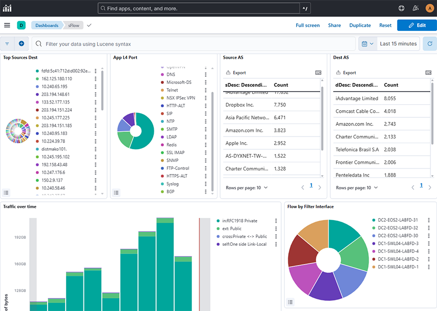
Select the sFlow* from the left-hsnd navigation bar in Production tab, and It summarizes information from the sFlow messages sent to the Arista Analytics server from the DANZ Monitoring Fabric Controller or other sFlow agents. This dashboard provides the following panels:
  • Top Sources Dest: Configures a real-time network traffic monitoring dashboard using sFlow data, displaying flows over a selected time range grouped by source (sHost.keyword) and destination (dHost.keyword) IPs/hosts, sorted descendingly to highlight top talkers and recipients for rapid traffic pattern analysis.
  • App L4 Port: Configures a real-time sFlow traffic dashboard displaying flows over a selected time range grouped by L4 application protocols (l4App.keyword) and sorted descendingly to highlight the most active applications for quick protocol-level traffic analysis.
  • Source AS: Displays a real-time tabular view of sFlow traffic data, showing the top source descriptions (sDesc) by flow count in descending order to highlight the most active network entities over a selected time range.
  • Dest AS: Displays a real-time tabular view of sFlow traffic data, showing the top source descriptions (dDesc) by flow count in descending order to highlight the most active network entities over a selected time range.
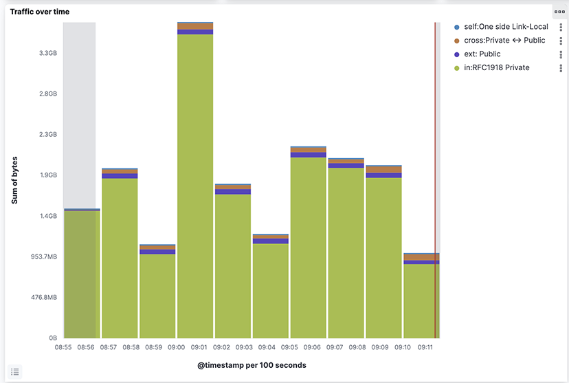
  • Traffic over Time: Configures a time-based stacked bar chart using sFlow data, showing the sum of upsampled byte counts over a selected time range, categorized by traffic type filters to analyze traffic distribution across private, public, and link-local networks.
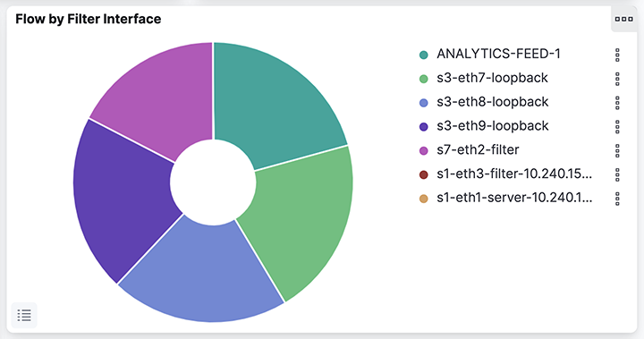
  • Flow by Filter Interface: Displays a donut chart using sFlow data to show the count of flow records over a selected time range, grouped by BT interface name (BTifName) in descending order to highlight the most active interfaces.
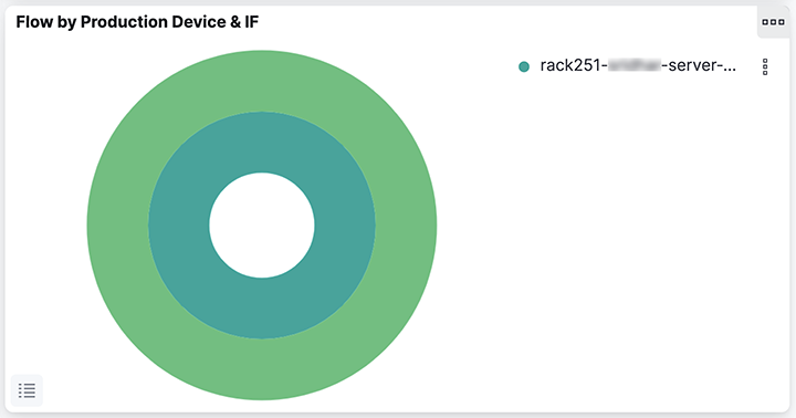
  • Flow by Production Device & IF: Displays a nested donut chart using sFlow data over a selected time range, grouping flow record counts by device and device port in descending order to identify the most active devices and their respective ports in the network.
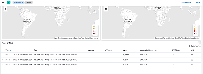
Selecting Dashboards → sFlow displays network traffic on the Analytic Node.
Figure 1. Production > sFlow Dashboard- Top
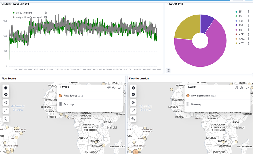
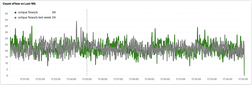
The middle dashboardinclude:
  • Count sFlow vs. Last Wk: Tracks the rate of unique network flows per second using sFlow data over a selected time range. It compares it with the same metric from the previous week for anomaly detection and traffic trend analysis.
  • Flow QoS PHB: Configures a real-time traffic classification dashboard using sFlow data, displaying the count of flows over a selected time range grouped by Differentiated Services Code Point (DSCP) values (phb.keyword), helping identify traffic prioritization and QoS usage patterns.
  • Flow Source: Displays global network traffic sources using sFlow data over a selected time range, mapped geographically to highlight the density and distribution of flow sources across regions.
  • Flow Destination: Displays global network traffic destinations using sFlow data over a selected time range, mapped geographically to highlight the density and distribution of flow destinations across regions.
Figure 2. Production > sFlow Dashboard- Middle
The lower dashboard includes:
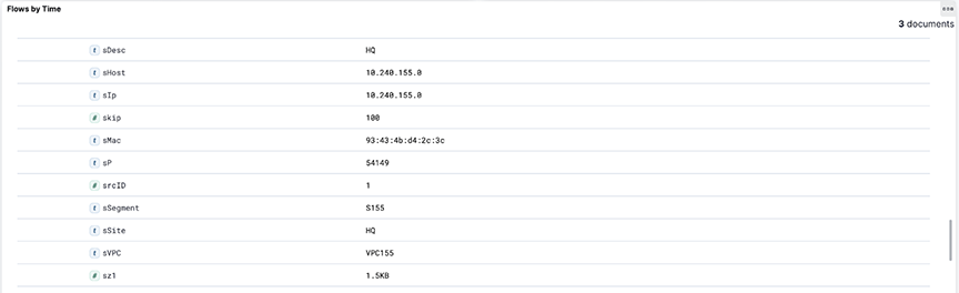
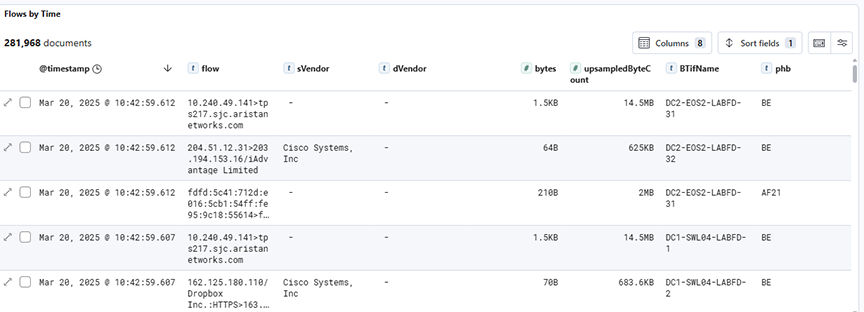
  • Flows by Time: Displays detailed raw sFlow traffic records over a selected time range, showing individual flow entries along with associated metadata such as source/destination vendors, byte counts, interface names, and PHB values for in-depth traffic inspection.
Figure 3. Production > sFlow Dashboard- Bottom

sFlow® Monitoring of MPLS and GRE Tunnels

Arista Analytics can process sFlow® records containing IP packets encapsulated in additional protocol headers:
  1. IPv4 and IPv6 packets encapsulated in one or more MPLS headers.
  2. IPv4 and IPv6 packets encapsulated in one or more GRE headers.
  3. Combination of (1) and (2).
  4. VXLAN encapsulated in one or more GRE headers

The following table shows the supported combinations of headers.

Table 1. Ethernet Support
1 Ethernet

MPLS(one or more)

IPv4/IPv6 TCP/UDP          
2 Ethernet IPv4/IPv6

GRE + IPv4/IPv6(one or more)

TCP/UDP          
3 Ethernet

MPLS(one or more)

IPv4/IPv6

GRE + IPv4/IPv6(one or more)

TCP/UDP        
4 Ethernet IPv4/IPv6

GRE + IPv4/IPv6(one or more)

UDP VxLAN Ethernet

VLAN(optional)

IPv4/IPv6 TCP/UDP

This feature enhances the visibility of tunnelled traffic by documenting the content of packet headers in Analytics' Elasticsearch database. It does not affect the current formatting of Elasticsearch documents containing VXLAN headers not encapsulated by any other tunnel header.

Elasticsearch Documents

It displays each encapsulated header in a JSON object whose name has an ‘e’ prefix followed by an integer corresponding to the position of the header in the packet, 1 being the outermost tunnel header. It displays the innermost header in a JSON object named innerPkt. The following is an example of such a JSON object:

"e1": {
		"encapType": "MPLS",
		"label": 90,
		"ttl": 10
	},
	"e2": {
		"encapType": "MPLS",
		"label": 91,
		"ttl": 9
	},
	"e3": {
		"encapType": "IPv4",
		"sIp": "10.99.230.30",
		"dIp": "10.51.49.227",
		"proto": 47
	},
	"e4": {
		"encapType": "GRE",
		"proto": 34525
	},{
	"sMac": "e2:d8:dd:e3:6a:57",
	"dMac": "84:3d:9c:be:a7:1a",
	
	"e5": {
		"encapType": "IPv6",
		"sIp": "4cdd:2cde:2ead:248e:1e9b:c3dc:9e3f:3d2b",
		"dIp": "9f0a:a91a:7e79:31e:78c8:e47b:1cd2:e783",
		"proto": 47
	}.
	"e6": {
		"encapType": "GRE",
		"proto": 2048
	},
	"e7": {
		"encapType": "IPv4",
		"sIp": "10.218.163.106",
		"dIp": "10.79.78.163",
		"proto": 17
	},
	"e8" {
		"encapType": "UDP",
		"sP": 9999,
		"dP": 4739
	},
	"e9": {
		"encapType": "VXLAN",
		"vni": 8888
	},
	"innerPkt": {
		"sMac": "16:af:16:2e:83:0c",
		"dMac": "e6:32:ff:5e:50:3f",
		"sIp": "10.44.66.146",
		"dIp": "10.218.200.227",
		"proto": 6,
		"sP": 7777,
		"dP": 443
	}
}	

Each header displays a different set of information.

For MPLS:
  • encapType: Always set to MPLS
  • label: MPLS label number
  • ttl: MPLS TTL
For GRE:
  • encapType: Always set to GRE
  • proto: Ethernet type
  • key: GRE key, if present
  • seqNum: GRE sequence number, if present
For VXLAN:
  • encapType: Always set to VXLAN
  • vni: VNI number
For IP headers that follow GRE headers:
  • encapType: IPv4 or IPv6
  • sIp: Source IP address
  • dIp: Destination IP address
  • proto: IP protocol number
For UDP header preceding an encapsulated VXLAN header:
  • encapType: UDP
  • sP: Source port
  • dP: Destination port

Troubleshooting

If sFlow documents do not appear in ElasticSearch, Arista Networks recommends creating a support bundle and contacting Arista TAC.

Limitations

  • Since MPLS headers do not include any information about the encapsulated packets, processing of MPLS encapsulating any header other than IPv4 or IPv6 will result in undefined behaviour.
  • It displays the IP addresses of headers that are outer-tunnelled the sFlow dashboard, but nothing beyond (e.g., UDP/TCP port number in inner headers).
  • This feature does not support the PseudoWire control word.
  • This feature supports up to 4 MPLS labels displayed on the dashboard. Packets with 5 or more MPLS labels will not appear on the dashboard, but they are present in Elasticsearch.

NetFlow

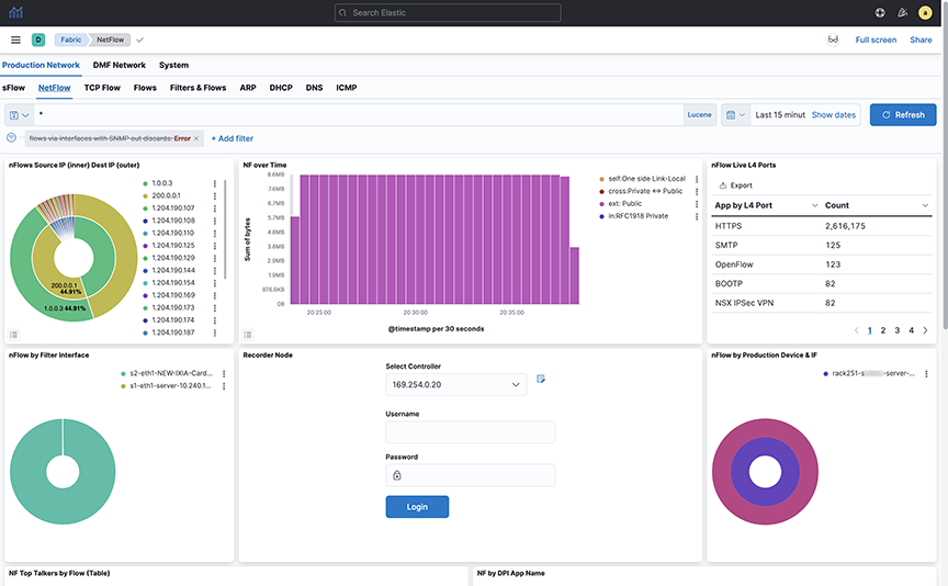
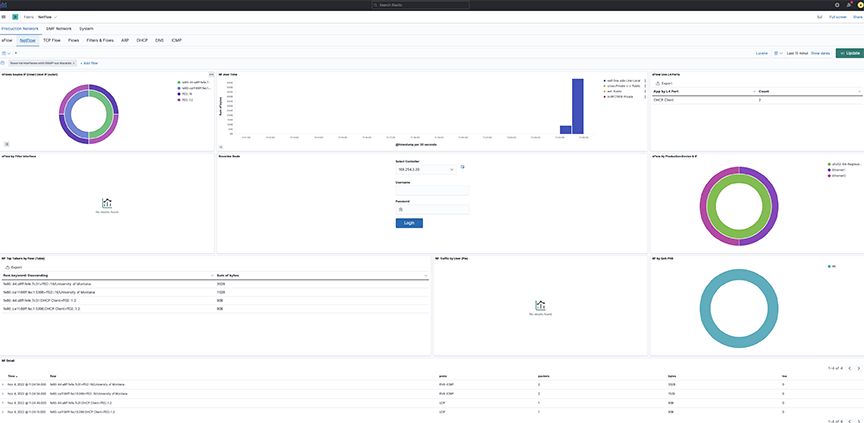
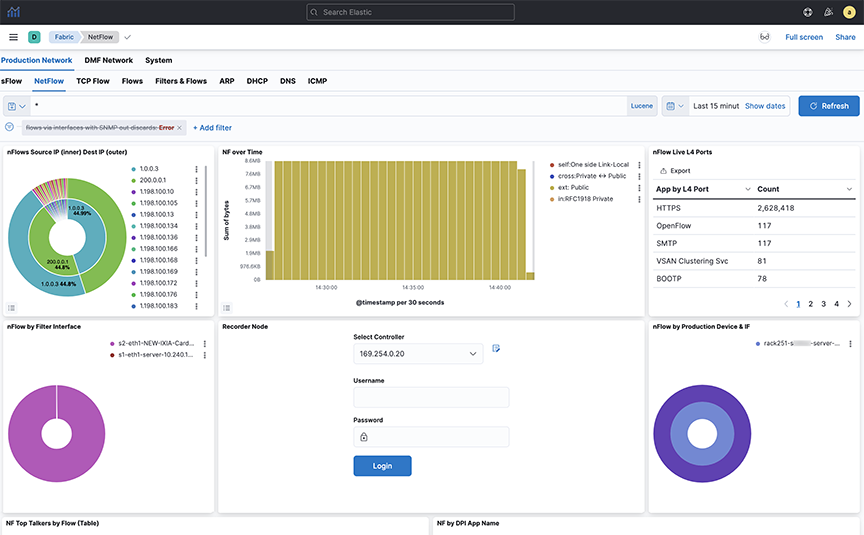
Selecting Production → NetFlow displays data transmitted on the Analytic Node.

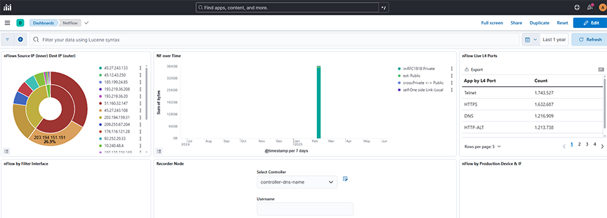
The dashboard displays:
  • nFlows Source IP (inner) Dest IP (outer): Displays NetFlow data over a selected time range, showing the count of flows grouped by source (slp) and destination (dlp) IP addresses in descending order to identify the most active endpoints.
  • NF over Time: Displays the sum of bytes over a selected time range, with time-based aggregation on the X-axis and filtered series split by traffic direction tags (for example, internal, external, cross, self) for comparative flow analysis.
  • nFlow Live L4 Ports: Displays the count of NetFlow records over a selected time range, grouped by the l4App.keyword field using a row-based split to categorize traffic based on Layer 4 application types.
  • nFlow by Filter Interface: Displays NetFlow data as a pie chart over a selected time range, counting flow records grouped by BTifName (interface name) in descending order to highlight the top 50 interfaces by activity.
  • Recorder Node
  • nFlow by Production Device & IF: Displays NetFlow data as a nested pie chart over a selected time range, showing the count of flow records grouped first by device name and then by device port, sorted in descending order to highlight the most active sources and interfaces.
Figure 4. Production > NetFlow Dashboard - Top
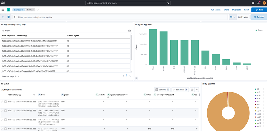
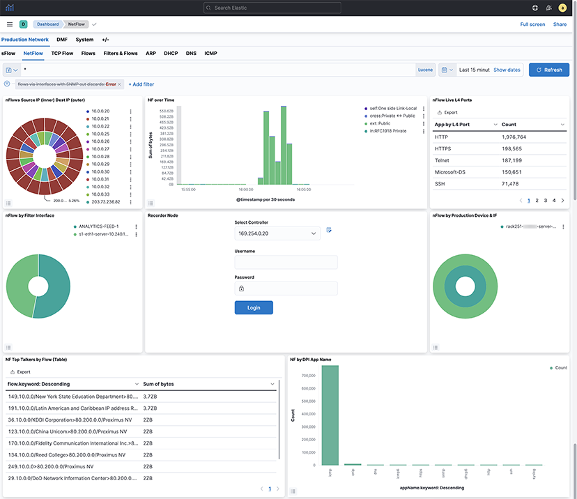
The bottom dashboard includes:
  • NF Top Talkers by Flow (Table): Displays NetFlow records in a table format over a selected time range, showing flow identifiers sorted in descending order to highlight the top talkers by flows.
  • NF by DPI App Name: Displays a count of NetFlow records over a selected time range, grouped by application name (appName.keyword) to identify the most active applications in the network traffic in descending order.
  • NF Detail: Displays detailed NetFlow records over a selected time range, showing individual flow entries and associated metadata such as source/destination IPs, protocol, packet, and byte counts, enabling granular network traffic inspection.
  • NF by Qos PHB: Displays a count of NetFlow records over a selected time range, grouped by Per-Hop Behavior (phb.keyword) in descending alphabetical order to analyze differentiated services traffic classification.
Figure 5. Production > NetFlow Dashboard- Bottom

TCP Flow

Selecting Production → TCPFlow displays data transmitted on the Analytic Node.

The information on the TCP Flow dashboard depends on TCP handshake signals and deduplicates. The switch description is specified in the Description attribute of each switch, configured on the DANZ Monitoring Fabric Controller.

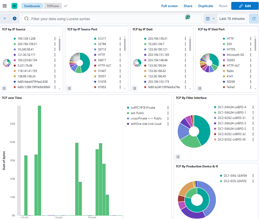
The dashboard displays:
  • TCP by IP Source: Displays the distribution of TCP connections over a selected time range, grouped by Source IP address (sip) and ordered by count in descending order.
  • TCP by IP Source Port: Displays the distribution of TCP connections over a selected time range, grouped by source port (sP.keyword) and sorted by connection count in descending order.
  • TCP by IP Dest: Displays the distribution of TCP connections over a selected time range, grouped by destination IP address (dlp) and ordered by count in descending order.
  • TCP by IP Dest Port: Displays the distribution of TCP connections over a selected time range, grouped by destination port (dP.keyword) and sorted by connection count in descending order.
  • TCP over Time: Displays the total bytes of TCP traffic over a selected time range, grouped by timestamp and categorized by traffic direction using tag-based filters (for example, private, public, and cross-zone flows).
  • TCP by Filter Interface: Displays the distribution of TCP connection counts over a selected time range, categorized by BT interface name using descending order of occurrence.
  • TCP By Production Device & IF: Displays the count of TCP connections over a selected time range, grouped first by device name and then by device port, using a nested pie chart.
Figure 6. Production > TCPFlow Dashboard - Top
The middle dashboard includes:
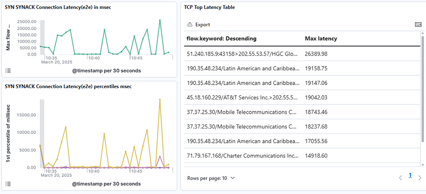
  • SYN SYNACK Connection Latency(e2e) in msec: Displays the maximum end-to-end SYN-SYNACK connection latency in milliseconds over a selected time range using a time-based line graph.
  • SYN SYNACK Connection Latency(e2e) percentiles: Displays the SYN-SYNACK end-to-end connection latency across multiple percentiles (1st, 5th, 25th, 50th, 75th, and 95th) over a selected time range using a time-series line graph.
  • TCP Top Latency Table: Displays the top TCP flows sorted by their maximum observed latency over a selected time range.
Figure 7. Production > TCPFlow Dashboard- Middle
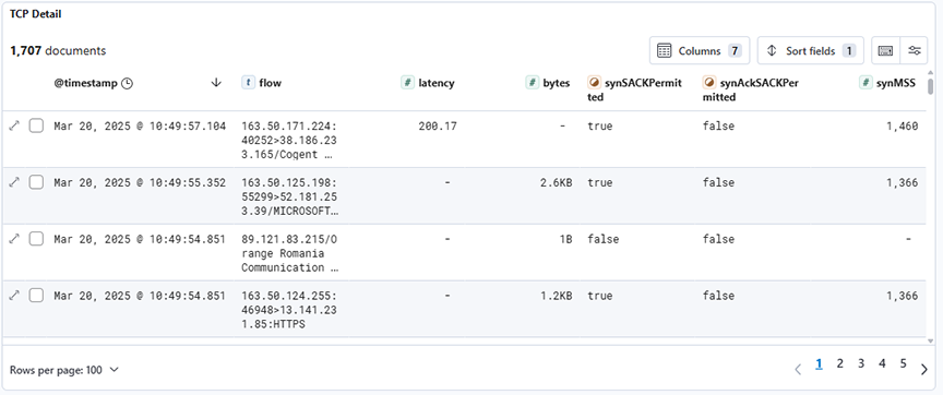
The lower dashboard includes:
  • TCP Detail: Displays detailed TCP connection records filtered by type:tcpconnection, showing attributes such as latency, byte count, and SYN/SYNACK flags for each flow over a selected time range.
Figure 8. Production > TCPFlow Dashboard- Bottom

Flows

Selecting Production → Flows displays the network's data efficiency, high traffic monitoring and scalability on the Analytic Node.

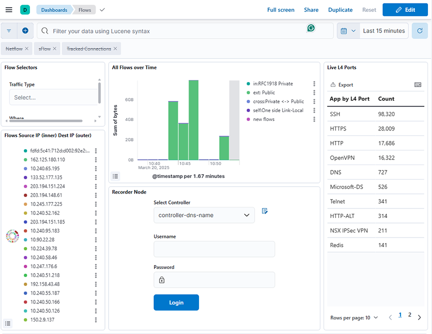
The dashboard displays:
  • Flow Selector: Allows network traffic data to be filtered using dynamic dropdowns for Traffic Type based on tags.keyword field, enabling users to interactively refine insights over a selected time range.
  • All Flows over Time: Displays the sum of bytes for different traffic categories (for example, private, public, cross-zone, link-local, and new flows) over a selected time range, using a date histogram with 100-second intervals.
  • Live L4 Port: Displays the count of flow records grouped by L4 application port over a selected time range using the l4App.keyword field for aggregation.
  • Flows Source IP (inner) Dest IP (outer): Displays the count of flows grouped first by source IP (sip) and then by destination IP (dip) over a selected time range.
  • Recorder Node: Refer to DMF Recorder Node.
  • Flow Heatmap VPCs: Displays a heatmap of the total bytes transferred between source VPCs and destination VPCs over a selected time range.
Figure 9. Production > Flows Dashboard - Top
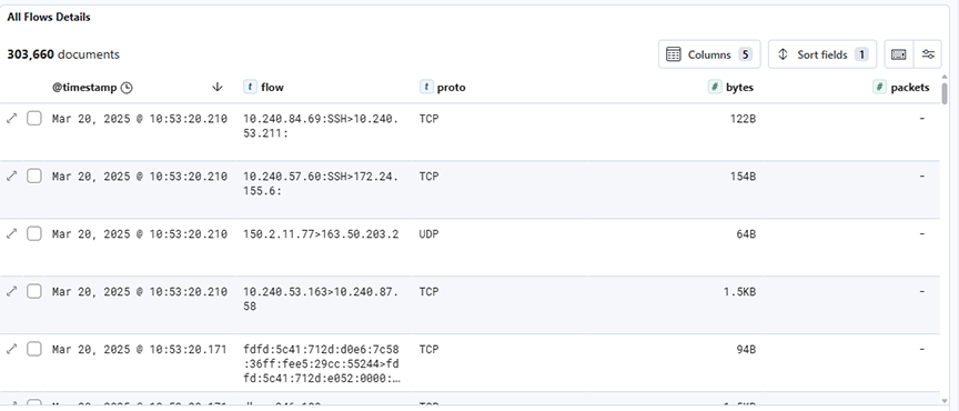
The lower dashboard includes:
  • All Flows Details: Displays detailed flow records filtered by flow type, including protocol, byte count, and packet count, over a selected time range.
Figure 10. Production > Flows Dashboard- Bottom

Filters & Flows

Selecting Production → Filters & Flows displays the selected MAC Address to access the Analytic Node.

The dashboard displays:
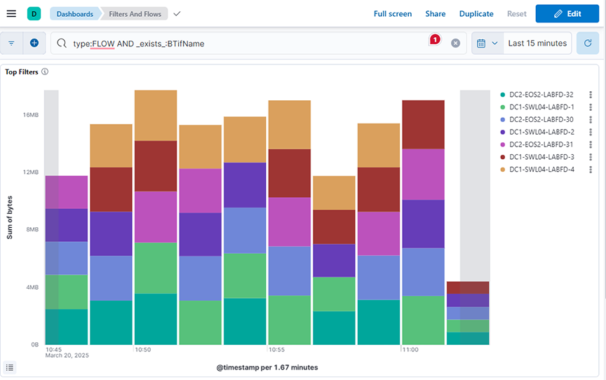
  • Top Filters: Displays the sum of bytes over time, grouped by top BTIfName values, over a selected time range.
  • Filter Top Flows: Displays the sum of bytes sent as flow traffic over time, split by BTIfName, and each segment further splits by flow1.keyword (descending)., over a selected time range.
  • Filter Bottom Flows: Displays the sum of bytes sent as flow traffic over time, split by BTIfName, and each segment further splits by flow1.keyword (ascending)., over a selected time range.
Figure 11. Production > Filters & Flows Dashboard - Top


Figure 12. Production > Filters & Flows Dashboard - Bottom

ARP

This data correlates with the tracked host feature on the DANZ Monitoring Fabric Controller. It shows all ARP data when you switch interface and production devices over time.

The Production → ARP displays:
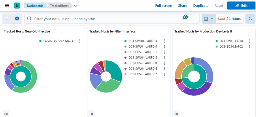
  • Tracked Hosts New-Old-Inactive: Displays the count of tracked hosts categorized as newly seen, previously seen, or inactive, grouped by OUI vendor over a selected time range.
  • Tracked Hosts by Filter Interface: Displays the unique count of tracked MAC addresses grouped by filter interface over a selected time range.
  • Tracked Hosts by Production Device & IF: Displays the unique count of tracked MAC addresses grouped by production device and interface over a selected time range.
Figure 13. Production > ARP Dashboard - Top
The middle dashboard includes:
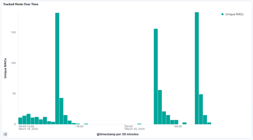
  • Tracked Hosts Over Time: Displays the unique count of MAC addresses over a selected time range using a date histogram to track the number of distinct tracked hosts seen over time.
Figure 14. Production > ARP Dashboard- Middle
The lower dashboard includes:
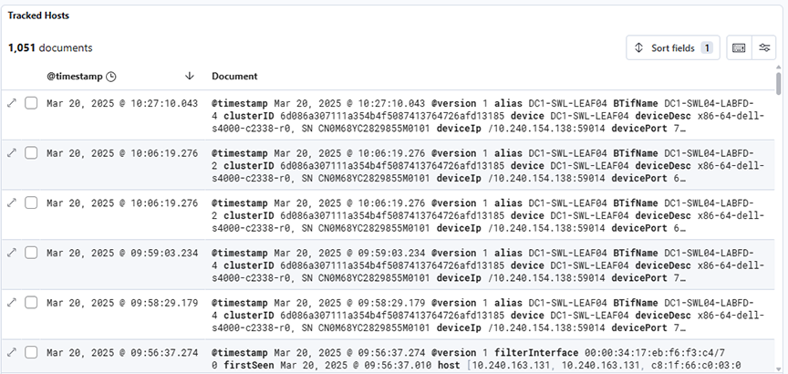
  • Tracked Hosts: Displays raw tracked host events over a selected time range, showing detailed logs with metadata such as timestamp, device, port, hostname, interface, and activity status.
Figure 15. Production > ARP Dashboard- Bottom

DHCP

Selecting Production → DHCP analyzes DHCP activity on the Analytic Node.

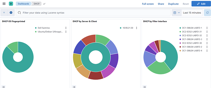
The DHCP Dashboard summarizes information from analyzing DHCP activity and provides the following panels. The dashboard displays:
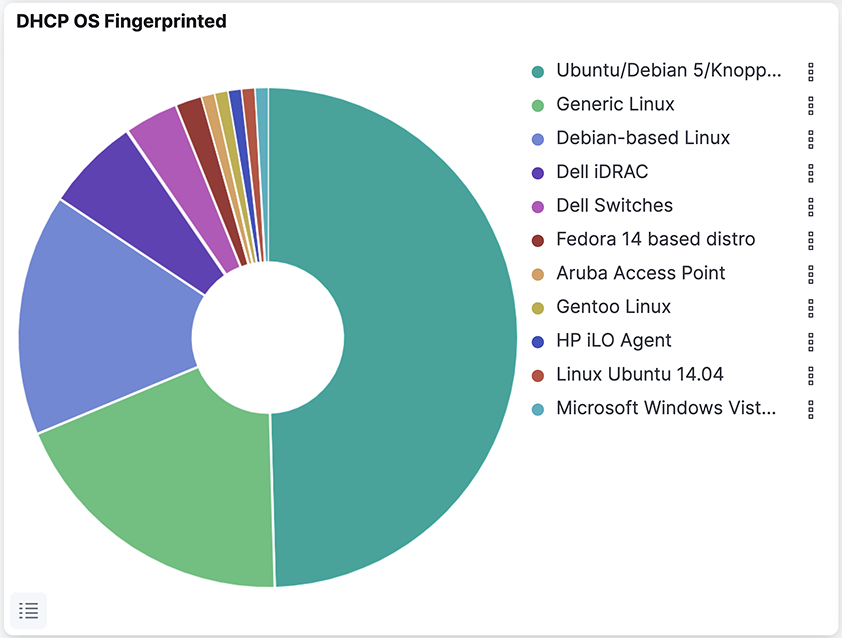
  • DHCP OS Fingerprinted: Displays the distribution of fingerprinted operating systems based on the unique count of host MAC addresses over a selected time range
  • DHCP by Server & Client: Displays the top server names and associated CNAMEs based on count over a selected time range.
  • DHCP by Filter Interface: Displays the distribution of DHCP message activity by filter interface, based on count, over a selected time range.
Figure 16. Production > DHCP Dashboard - Top
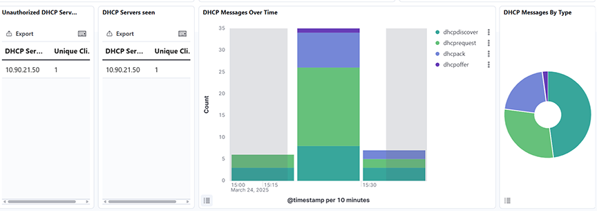
The middle dashboard includes:
  • Unauthorized DHCP Server: Identifies unauthorized DHCP servers by displaying the unique number of clients they responded to with DHCP offers, excluding known valid servers, over a selected time range.
  • DHCP Server seen: Displays all DHCP servers that sent offers and the count of unique clients they responded to, excluding 0.0.0.0 addresses, over a selected time range.
  • DHCP Messages Over Time: Displays the distribution of DHCP message types (for example, discover, offer, request, ack) over a selected time range, using a date histogram split by message type.
  • DHCP Messages by Type: Displays the distribution of DHCP message types by count over a selected time range, using a pie chart segmented by the type.keyword field.
Figure 17. Production > DHCP Dashboard- Middle
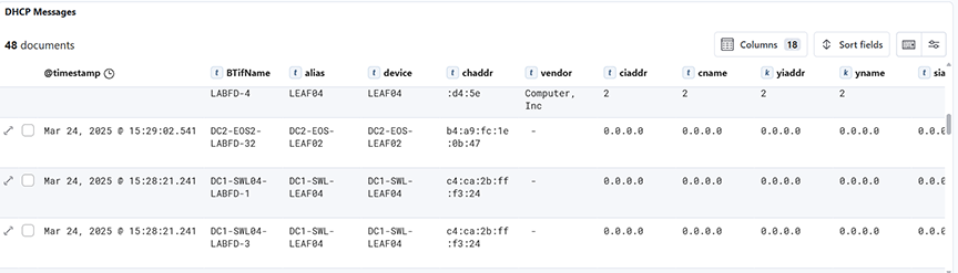
The lower dashboard includes:
  • DHCP Messages: Displays a time-series histogram and detailed document table of DHCP messages filtered by type over a selected time range.
Figure 18. Production > DHCP Dashboard- Bottom

DNS

Selecting Production → DNS analyzes DNS activity on the Analytic Node.

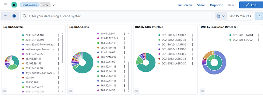
The DNS Dashboard summarizes information from analyzing DNS activity and provides the following panels. The dashboard displays:
  • Top DNS Server: Displays the top 25 DNS servers by request count over a selected time range, using a pie chart segmented by server name.
  • Top DNS Clients: Displays the top 25 DNS clients based on query count over a selected time range, represented as pie chart segments grouped by client name.
  • DNS by Filter Interface: Displays the top 60 DNS query sources based on the BTIfName field, counted and ordered by frequency over a selected time range.
  • DNS by Production Device & IF: Displays DNS query counts grouped by production device and interface, using a nested split on device and devicePort fields over a selected time range.
Figure 19. Production > DNS Dashboard - Top
The middle dashboard includes:
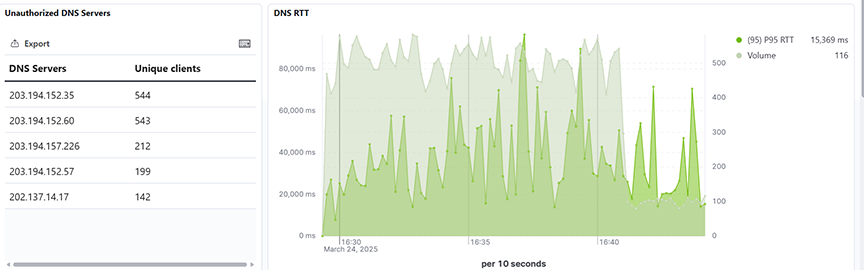
  • Unauthorized DNS Server: Displays the top unauthorized DNS server, excluding a defined list of approved IP ranked by their unique client count over a selected time range.
  • DNS RTT: Displays the 95th percentile of DNS Round-Trip Time (RTT) and the query volume, aggregated over time, for all sources over a selected time range.
Figure 20. Production > DNS Dashboard- Middle
The lower dashboard includes:
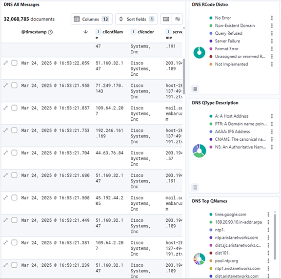
  • DNS All Messages: Displays all DNS-related log messages along with key fields like client IP, server name, RTT, and query types over a selected time range.
  • DNS Rcode Distro: Shows the distribution of DNS Response Codes (RCode) based on their frequency over a selected time range.
  • DNS QType Description: Shows the distribution of DNS Query Types (QTypes) based on their frequency over a selected time range.
  • DNS Top QNames: Shows the top Queried domain Names (QNames) in DNS traffic, ranked by count over a selected time range.
Figure 21. Production > DNS Dashboard- Bottom
Note: The query and response packet timestamps compute the DNS RTT value. If a query packet does not answer by a response packet within 180 seconds, then the RTT value is set to -1.

ICMP

The ICMP Dashboard summarizes information from analyzing ICMP activity and provides the following panels.

The dashboard displays:
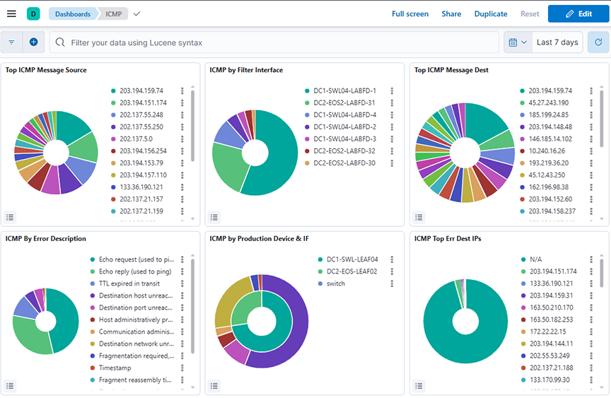
  • Top ICMP Message Source: Displays the top source IPs sending ICMP messages, ranked by count over a selected time range.
  • ICMP by Filter Interface: Displays the distribution of ICMP messages by filter interface (BTIName) over a selected time range.
  • Top ICM Message Dest: Displays the top destination IP addresses for ICMP messages over a selected time range.
  • ICMP by Error Description: Displays the distribution of ICMP messages categorized by error description over a selected time range.
  • ICMP by Production Device & IF: Displays ICMP message distribution grouped by production device and interface over a selected time range.
  • ICMP Top Err Dest IPs: Displays the top destination IPs associated with ICMP error messages over a selected time range.
Figure 22. Production > ICMP Dashboard - Top
The middle dashboard includes:
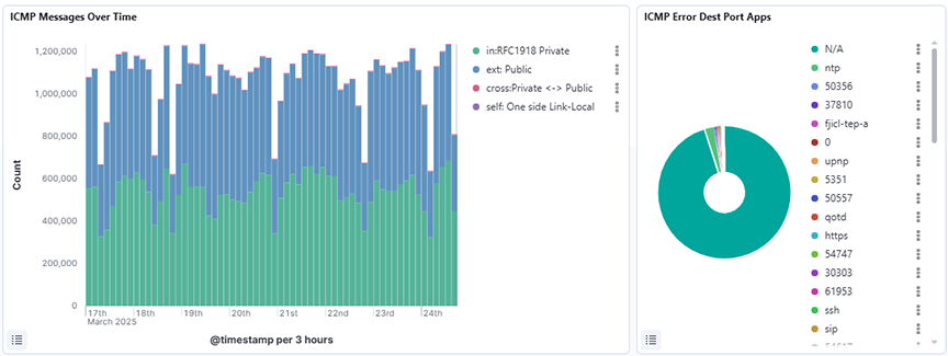
  • ICMP Messages Over Time: Displays the count of ICMP messages over a selected time range, broken down by traffic tags such as private, public, cross, and self, using a date histogram on the timestamp field.
  • ICMP Error Dest Port Apps: Displays the distribution of destination port applications that triggered ICMP errors over a selected time range, using a pie chart grouped by the errPortApp.keyword field and sorted by descending count.
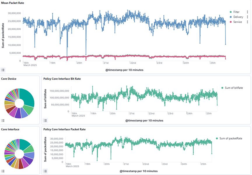
Figure 23. Production > ICMP Dashboard - Middle
The lower dashboard includes:
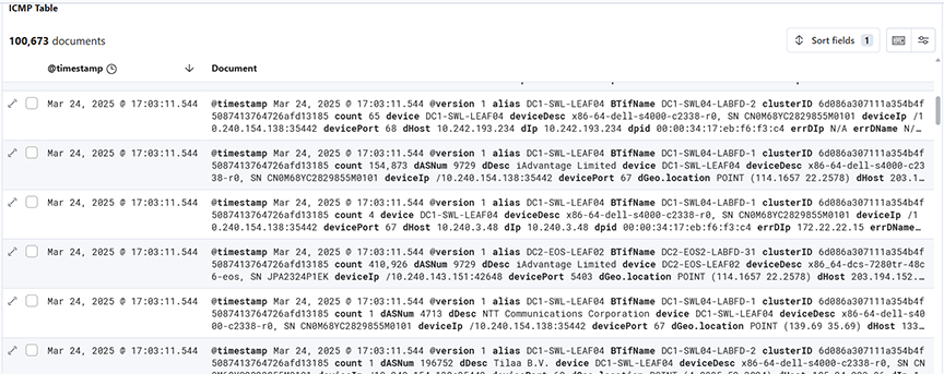
  • ICMP Table: Displays a detailed table of ICMP packet metadata over a selected time range, including fields such as timestamp, source and destination IPs, device info, error descriptions, and message types for in-depth analysis.
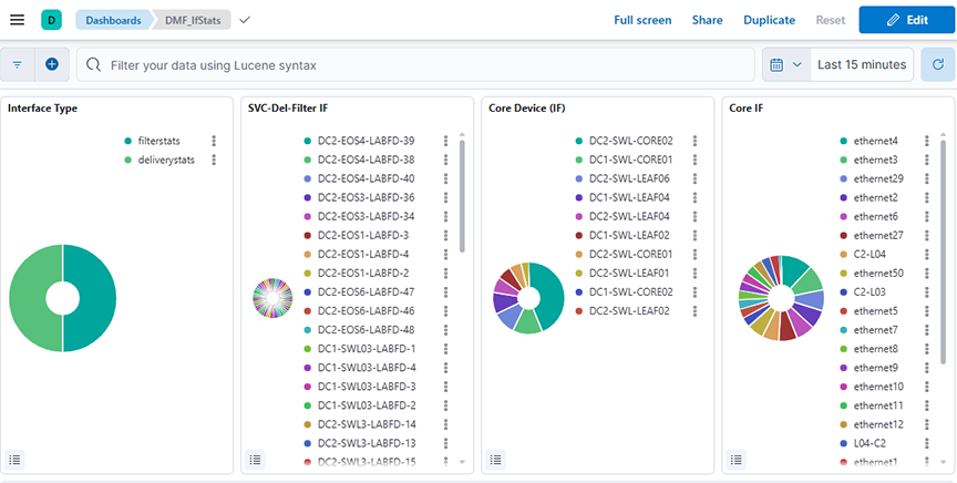
Figure 24. Production > ICMP Dashboard- Bottom
*sFlow® is a registered trademark of the Inmon Corp.

Introduction

Arista Analytics Node provides scale-out analytics with configurable, historical time-series-based dashboards for flow visibility, health, performance, and capacity planning. It acts as a collector for NetFlow and sFlow packets to provide real-time visibility, including tunneled or encapsulated traffic, enabling the detection of security attacks like DoS/DDoS and SYN attacks. The highly intuitive and customizable GUI dashboards support a search to drill down and focus on possible issues quickly. It provides a variety of reporting and alerting functions and allows the user to easily share custom dashboard views with other team members for collaborative analysis, troubleshooting, and remediation.

Analytics and Dashboards

Arista Analytics provides the accessibility to analyze, search, predict, and reveal patterns and relationships among data.

The following options to access Arista Analytics features:
  • Dashboard: Monitors traffic flow, network health, performance, and capacity planning. There is an option to customize dashboards.
  • Discover: Use predefined indices to filter and display specific events.
  • Machine Learning: Detect, model, and predict unusual activity or events on the network.
The Arista Analytics displays in the following tabs:
  • Production Network: This analyzes the main operational network.
  • DMF: This is for observing the dedicated monitoring network.
  • System: This configures the analytics system itself.
  • Network: This manages the analytics system.
  • VoIP: This configures the analytics system itself.
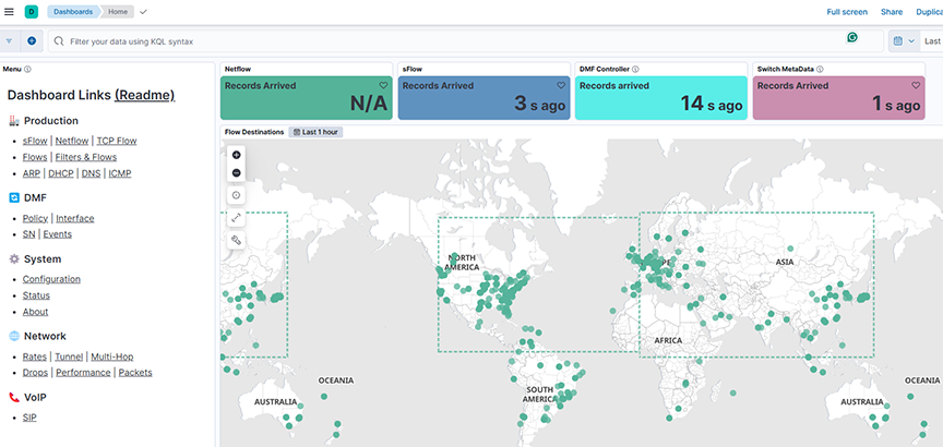
Figure 1. Production Network > Dashboard
Each tab utilizes panels that display data through:
  • Visualizations (pie charts, line graphs, etc.) based on queries.
  • An event list at the bottom shows matching events.
  • Pop-up windows for detailed information on panel mouseovers.

It provides a clear structure for monitoring and managing network performance and system settings.

The Kibana documentation documents the Analytics GUI, and most of its features and operations based on ElasticSearch are available at the following URL:

https://www.elastic.co/guide/en/kibana/8.15/index.html

Common Features and Functions

The Arista Analytics displays in the following visualizations:
  • Area: Emphasize the data between an axis and a line
  • Data Table: Displays data in rows and columns.
  • Heat map
  • Horizontal bar
  • Line
  • Metric
  • Recorder Node
  • Tag Cloud
  • Timelion
  • Vertical bar

Filtering Information on a Dashboard

The interactive filtering capabilities of the Arista Analytics dashboard:
  • Area-Based Filtering: Selecting an area on the dashboard restricts the displayed events to those similar to the selected area. It allows for context-sensitive filtering.
  • Pie Chart Slice Filtering: Clicking a slice of a pie chart filters the dashboard to show only events related to the specific activity represented by that slice. It is a direct way to isolate and examine particular activities.
  • Color Customization: Users can change the color associated with protocols or other objects by clicking their labels in the list beside the chart. It enhances visual clarity and allows for personalized data representation.

Pie

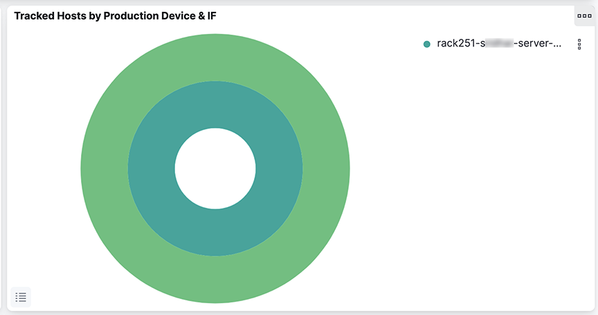
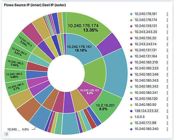
Pie charts that display information by the production switch have an inner and outer ring, as shown in the following example.
Figure 2. Two-ring Pie Chart

For example, in the Tracked Hosts by Production Device & IF pie chart,

the detailed behavior of the pie charts in the Arista Analytics Fabric view, specifically those displaying information related to production switches, is shown. The key feature is the dual-ring structure:

  • Inner Ring: Represents a broader category, "Production Device" (switches).
  • Outer Ring: Provides a more granular breakdown, such as "Interface" (IF) details selected inner ring segment.

The interactive functionality is crucial, as clicking a segment in the inner ring filters the outer ring to display only the data relevant to that selected inner ring segment.

It allows for a hierarchical view of the data, enabling users to quickly drill down from a general overview (switch level) to specific details (interface level) within that overview. It is a good design for exploring relationships within the network data.

Selecting the Time Range

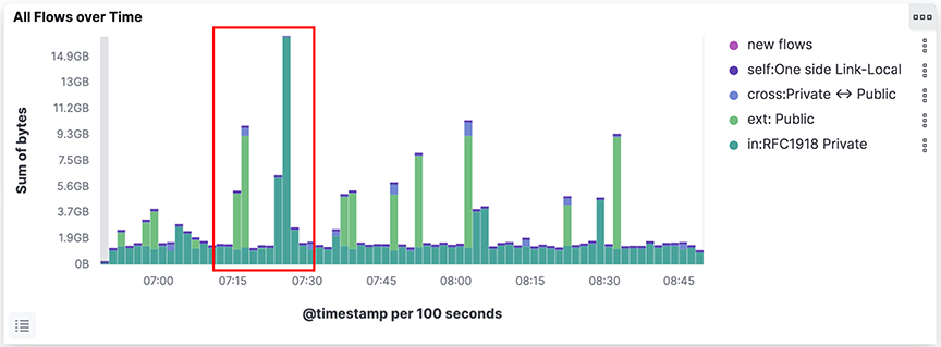
To restrict the current content to events occurring in a specific period, click and drag it to surround the area on a time visualization, such as the Flows Over Time.
Figure 3. Selecting the Time Range
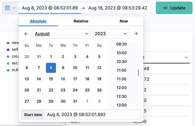
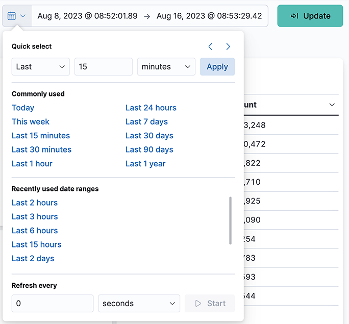
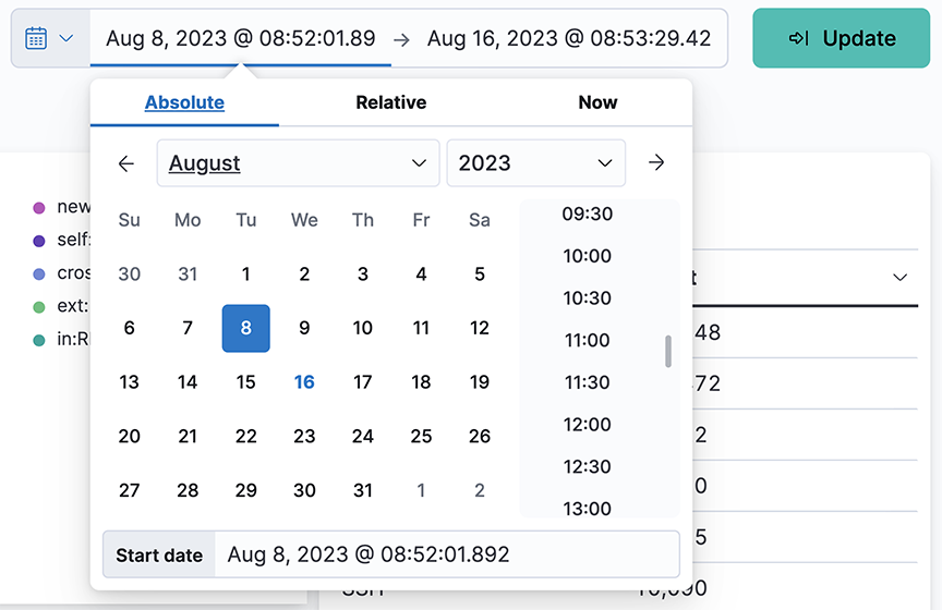
To select the time range or to change the default refresh rate, click the Time Range control in the upper right corner. The system displays the following dashboard.
Figure 4. Time Range Control
This dialog provides the following options for setting the time range:
  • Quick: Simple settings, such as Today, Last 1 hour, etc.
  • Relative: Time offsets from a specific time, including the current time.
  • Absolute: Set a range based on date and time.
  • Recent: Provides a list of recently used ranges that you can reuse.
Select the range from the options provided, and the panels and displays update to reflect the new date and time range. To change the auto-refresh rate, click the Auto-refresh control. The system displays the following dashboard.
Figure 5. Change Auto Refresh Rate

Select the refresh interval from the options provided. Click Start to turn off the auto-refresh function.

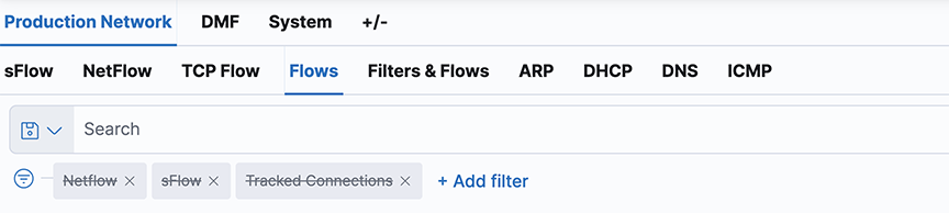
Using the Search Field

The search field at the top of the dashboard filters the current displays by any text or numbers typed into the field.
Figure 6. Search Field
The green bars under the Search field show the currently applied filters. When the pointer is over a green bar, it displays icons thatcontrol the filter.
  • Enable/Disable filter
  • Pin/Unpin filter
  • Exclude/Include matches
  • Remove filter
  • Edit filter

The Action option in the upper right corner applies these actions to all the currently applied filters.

Click a segment on a pie chart for the appropriate filter; it automatically inserts into the Search field. To undo the filter, click the Remove filter icon.

To filter the information in the displays, enter the characters to filter the display in the search field. For example, for entering the first part of an IP address, it updates the displays to show only those IP addresses that match the characters entered. The following are some of the most helpful search filters:
  • IP address
  • Host name (requires DNS services)
  • Protocol, for example, HTTP, HTTPS, ICMP, and so forth
  • DMF interface name

To define complex queries using field names, which can be seen by scrolling and clicking on an event row. For example, on the sFlow®* dashboard, the query proto : TCP AND tags : ext displays all externally bound TCP traffic. OR NOT ( ) are also permitted in the expression. For more details about the supported search syntax, refer to the following URL:https://www.elastic.co/guide/en/elasticsearch/reference/current/query-dsl-query-string-query.html#query-string-syntax.

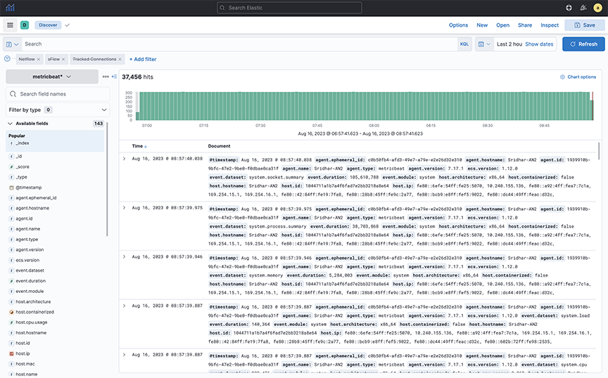
Using Discover Mode

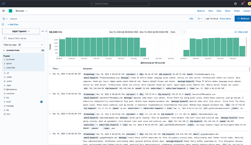
Select the Discover option in the left panel of the Analytics window; the system will display the following page.
Figure 7. Discover Mode

Use Discover mode to see the indices in the ElasticSearch database and identify the available data.

Search Performance Limitations

Refrain from executing general queries for a wide time range. For example, suppose you want to query for 7 or 30 days. In that case, do a specific query flow, filter interface, specific source or destination IP address, and specific source or port number as it eases the query load.

To query NetFlow or sFlow® for more extended periods, use the FLOW Dashboard to determine the trend and then do a specific query, such as querying a specific flow or time, on the Netflow or sFlow® dashboard.

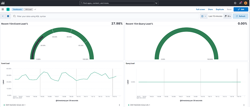
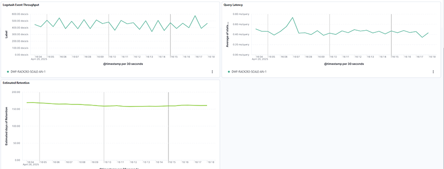
Periodically monitor the AN Load Dashboard for index and query load and scale up the Analytics Node if the Load is Yellow/Red.

These recommendations aim to optimize query performance and prevent system overload, especially when dealing with large datasets and extended timeframes.

Managing Dashboards

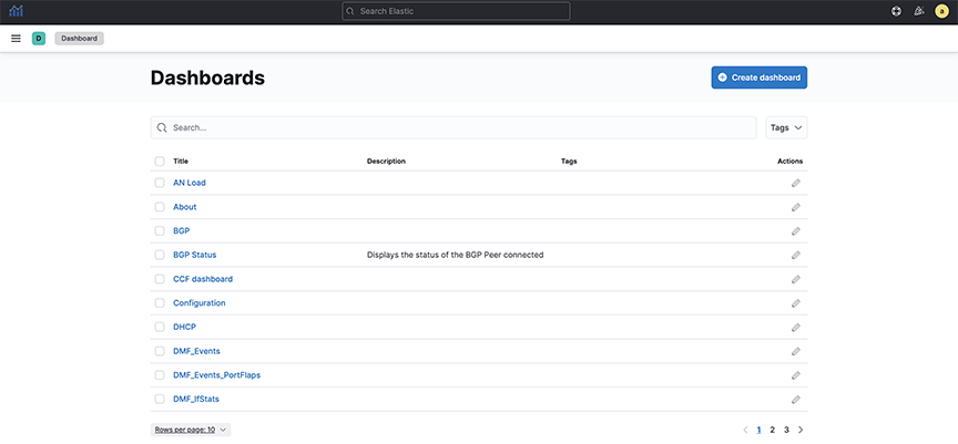
Select the Dashboards option from the left panel on the Analytics window to manage Dashboards. The system displays the following page.
Figure 8. Dashboard Mode

Refer to the Kibana documentation for details about creating and managing dashboards.https://www.elastic.co/guide/en/kibana/8.15/index.html

Following are the best practices for managing dashboards and saved objects within Arista Analytics, focusing on organization, maintainability, and upgrade compatibility:

  • Consistent Naming Conventions: Employ a naming convention that aligns with your environment.
    • Use prefixes to categorize dashboard content (for example, "ARISTA").
    • Include descriptive terms in the dashboard name to specify its type.
    • It improves organization and simplifies selection.
  • Simplified Management: Consistent naming allows for easier individual selection and bulk operations.
    • Exporting dashboards based on their type facilitates tracking and management of modifications.
  • Upgrade Compatibility: Build dashboards using custom visualizations and searches created for your environment.
    • Avoid relying on default objects, which might change during upgrades, potentially breaking your dashboards.

In summary, the best practices advocate for a structured and organized approach to dashboard management, ensuring maintainability, traceability, and resilience to system upgrades.

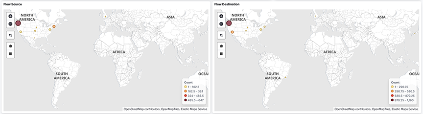
Geographic Location

  • GeoIP Database: Arista Analytics uses the MaxMind GeoIP database to associate public network IP addresses with geographic locations.
  • Map Visualization: This association displays a heat map on the sFlow® dashboard.
  • Geographic Filtering: It filters the traffic shown on the map by selecting specific regions:
    • Square Tool: Draw a square to select a rectangular area.
    • Polygon Tool: Draw an irregular shape to select a more complex region.
    • Zoom and Detail: Selecting a region will zoom in on that area and provide more detailed information about the traffic flowing to or from it.
Figure 9. Geographic Flow Source and Destination

This process enables users to visually analyze network traffic patterns based on geographic location and focus on specific areas of interest for deeper investigation.

IP Addresses

This section describes identifying traffic transmitted or received by the source or destination IP address.

Source and Destination Addresses

Figure 10. Identifying Source and Destination IP Addresses
Click an IP address, then click the Magnifying Glass icon (+) to pin the address to the dashboard.
Figure 11. Filtering Results by IP Address

The selected IP address is added to the filters on the dashboard.

Each dashboard has a bar chart depicting traffic on the y-axis and time on the x-axis. To add a time filter, click and drag an area in the All Flows Over Time bar chart.

Interfaces Sending or Receiving Traffic

To identify specific interfaces that are sending or receiving traffic, select the following features:
  • DMF Top Filter interfaces
  • Production interfaces
Figure 12. DMF Filter Interfaces
Figure 13. sFlow® > Flow by Production Device & IF

This information derives from the LLDP/CDP exchange between the production and DANZ Monitoring Fabric switches.

Filter Interface Information

Add the filter interface name to the NetFlow dashboard to see hop-by-hop forwarding of flows for NetFlow traffic coming from the DMF Service Node for a specific flow. Arista Analytics then shows the filter interface name associated with that flow. It allows the network administrators to visualize the path a particular flow took through the network. If a flow goes through multiple hops, the dashboard would ideally display multiple "filter interface names," clearly indicating the sequence of interfaces.

Displaying Filter Interface Names

The nFlow by Filter Interface window on the NetFlow dashboard, shown later, can display the filter interface name where traffic is coming in for the NetFlow service. To display this information, enable the records-per-interface option in the NetFlow managed service configuration on the DANZ Monitoring Fabric Controller using the commands shown in the following example.
controller(config)# managed-service netflow-managed-service
controller(config-managed-srv)# service-action netflow netflow-delivery-int
controller(config-managed-srv-netflow)# collector 10.8.39.101 udp-port 2055 mtu 1500 records-per-interface
Figure 14. Production Network > NetFlow Dashboard with Filter Interface Name

NetFlow Managed Service Records-per-interface Option

The following example displays the running-config for this configuration.
! managed-service
managed-service netflow-managed-service
	service-interface switch 00:00:4c:76:25:f5:4b:80 ethernet4/3:4
	!
	service-action netflow netflow-delivery-int
		collector 10.8.39.101 udp-port 2055 mtu 1500 records-per-interface
controller(config)# sh running-config bigtap policy netflow-policy
! policy
policy netflow-policy
	action forward
	filter-interface filter-int-eth5
	use-managed-service netflow-managed-service sequence 1 use-service-delivery
	1 match any

After enabling this option, the nFlow by Filter Interface window, shown earlier, displays the filter interface identified in the policy that uses the NetFlow managed service.

The production device port connected to the filter interface sends LLDP messages; Arista Analytics also displays the production switch name and the production interface name attached to the filter interface in the nFlow by Production Switch & IF window.

In the example later, wan-tap-1 displays in the nFlow by Filter Interface window. The production device N1524-WAN and the interface Gi1/0/1, connected to filter interface wan-tap-1, are displayed in the nFlow by Production Switch & IF window.
Figure 15. Production Network > NetFlow Dashboard with Filter Interface Name
*sFlow® is a registered trademark of the Inmon Corp.
Arista Analytics
User Guide
Arista Networks

www.arista.com

Arista Analytics User Guide

Version 8.9
DOC-08663-01


Headquarters
5453 Great America Parkway
Santa Clara, CA 95054, USA
+1-408 547-5500
www.arista.com
Support
+1-408 547-5502
+1-866 476-0000
This email address is being protected from spambots. You need JavaScript enabled to view it.
Sales
+1-408 547-5501
+1-866 497-0000
This email address is being protected from spambots. You need JavaScript enabled to view it.
© Copyright 2026 Arista Networks, Inc. The information contained herein is subject to change without notice. Arista Networks and the Arista logo are trademarks of Arista Networks, Inc., in the United States and other countries. Other product or service names may be trademarks or service marks of others.