Dashboards
CV-CUE provides varied widgets on its Connectivity and Performance dashboards that promote actual cause of issue, not just related client statistics, to drive faster troubleshooting efforts. With Dashboards, you receive immediate feedback when performing remediation thus democratizing Wi-Fi troubleshooting for level one and junior support staff.
Where applicable, dashboard widgets show values for both IPv4 and IPv6. This gives a more granular view of the network. For example, the Average Latencies widget on the Performance Dashboard shows the latency values for both v4 and v6 paths, helping you identify if the issue lies with only one of the IP addresses.
SLA Dashboard
The SLA Dashboard provides an overview of network, device, and application health at the location level, presented in absolute percentages. CV-CUE calculates the percentage value for each parameter, except WIPS, based on the configured threshold. The SLA Dashboard provides the flexibility to configure static thresholds and track deviations. In contrast, the other Overview Dashboards (Widget View and Map View) provide a hands-free and detailed view of each KPI.
Network Administrators can configure the thresholds for various KPIs, and the thresholds apply to all locations. The SLA Dashboard highlights all the underperforming KPIs that cross the threshold for each location.
With a quick scan of the SLA Dashboard, you can obtain a visual summary of the overall network health and identify underperforming KPIs across all locations.

Interpreting the SLA Dashboard
Configuring Thresholds
Click the Set Thresholds icon on the SLA Dashboard to configure the following thresholds: Connectivity, Performance, Application Experience, Infrastructure, and WIPS.
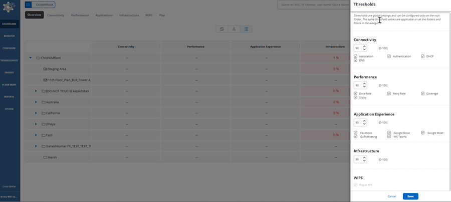
The threshold for WIPS, typically the count of Rogue APs, is an absolute number. The other parameters are shown in percentages.
Connectivity Dashboard
The Connectivity Dashboard provides the health of all the clients and devices that are present in a WLAN network, on the selected folder or floor. It comprises a number of widgets, which provide information of the connectivity strength in a single glance.
Navigate to Dashboard > Connectivity to view the Connectivity Dashboard.
The Connectivity Dashboard contains the following widgets:
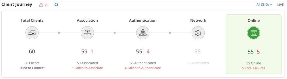
- Client Journey
- It provides an overview of various aspects of the client such as number of active clients, associations to the Wi-Fi, successfully authenticated clients, total number of clients connected to the network, and number of online clients.
- Clients by Most Failed Connections
- Lists the number of times a client failed to connect. The clients are listed in decreasing order of failed attempts and then alphabetically.
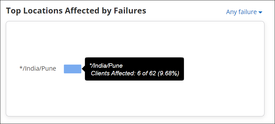
- Top Locations Affected by Failures
- Displays the top five locations which are affected by association, authentication or network failure. The locations are listed in decreasing order based on the percentage of connection failures.
- Baseline - Clients Affected by Failures
- CV-CUE calculates a baseline for the percentage of clients that failed due to connectivity issues. The connectivity issues taken into consideration are: Authentication failure, Association failure, and Network failure.
Client Journey
Client Journey depicts the current state of the network for the selected folder or floor. It provides an overview of various aspects of the client such as number of active clients, associations to the Wi-Fi, successfully authenticated clients, total number of clients connected to the network, and number of online clients.
You can hover the mouse over the different phases of the client journey to get additional information. For example, if you hover the mouse over the Authentication phase, a tool tip displays information such as percentage of authenticated clients, number of clients who failed to authenticate, type of authentication failure with the number of clients that failed to authenticate for a type of authentication.
You can click on the different phases to view detailed information of each phase. For example, if you click Association, you will be redirected to a page that provides detailed information of the client health displaying a list of clients that failed to associate.
- Total Clients
- The Total Clients section displays the number clients that connected or tried to connect to the network. It includes the total number of clients that associated with an SSID on the network and the total number of clients that failed to associate. Click Total Clients to view a list of clients with their detailed information.
- Association
- The Association section displays the total number of clients that are successfully associated to a Wi-Fi network and the total number of clients that failed to associate to the Wi-Fi network. Click Associations to view a list of clients with failed associations.
- Authentication
- The Authentication section displays the total number successfully authenticated clients and the clients that failed to authenticate through the Wi-Fi network.
- Network
- The Network section displays the total number of clients that could successfully access the network services like DHCP, DNS and also those that failed to access these services.
- Online
- The Online section displays the total number of online clients that successfully connected to the Wi-Fi network. It also displays the total number of clients that failed to authenticate, associate or access the network.

- You can search a client by providing MAC address, IP address, user name or device name. You get the status of the various phases of that client, with the time stamp.
Search Icon on Client Journey
You can search an active client by providing MAC address, IP address, user name or device name. You get the status of the last attempted connection, in the various phases of the active client, with a time stamp.
- No connection records found in currently active clients: No results are displayed because the searched active client is not available on the selected folder or floor.
- Search historical client records?: A link that suggests to look for the searched client in the historical records. This option is displayed when the searched client was active in the past and unavailable at the moment. After clicking on the link, you are redirected to the list of clients and you can click on the name of the client for a detailed information. Refer Client Connection Logs for more information about the logs. The historical data for the last seven days is available in the logs.
| Option | Description |
|---|---|
| Tried to connect | Name of the client and a link that redirects you to the Connection log for the searched active client. |
| Association |
|
| Authentication |
|
| Network |
|
| Online |
|
The data on the widget can be filtered using the available filters on the top right corner of the widget. To know more about the filters refer Filters on Widgets.
Top Locations Affected by Failures
The widget displays a horizontal bar graph depicting the top five locations that are affected by association, authentication, or network connection failure. The graph contains the data for the selected parent and its immediate child folders.
The graph shows the top five locations with highest connection failure percentage in decreasing order.
If you hover the mouse over a bar in the graph, the tool-tip displays the number of clients that are affected due to the connectivity failure with respect to the total number of clients associated to an AP at that location. When you click a bar, on that location, you are redirected to a page that has detailed information of the clients affected by the connection failure at that location.
Clients by Most Failed Connections
Clients by Most Failed Connections lists the number of times a client failed to connect. The clients are listed in a decreasing order of failed attempts and then alphabetically.
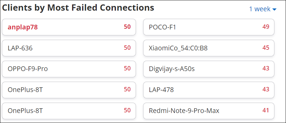
When you click on the client name, you are directed to the Client connections log widget, where you get the detailed information of the failures. The maximum duration supported by the graph is 1 week and the minimum duration is 2 hours. You can select the duration from the drop-down list which is located at the top-right corner of the widget.
Performance Dashboard
The Performance Dashboard provides detailed information about the performance of the Wi-Fi network with the help of a number of graphs and widgets.
- Client Health
- Displays the total number of clients for the selected folder or floor, with Low RSSI, Low Data Rate, High Retry %, and Sticky Clients.
- Avg Latencies
- Displays the average latency time (response time) taken by the servers like DHCP, DNS, and AAA servers with respect to the clients on a selected folder or floor.
- Baseline - Clients Affected by Poor Performance
- Displays the baseline for the percentage of clients affected by poor performance for all the clients over a period of time.
- Clients by Avg. Data Rate
- Displays a bar graph that shows the average data rate of the clients on a selected folder or floor.
- Clients by RSSI
- Displays a bar graph showing the total number of clients and the RSSI values.
- Clients With Most Traffic
- Displays a horizontal bar graph of clients with highest data usage.
- Top Locations Affected by Poor Performance
- Displays a horizontal bar graph of locations with highest performance issues, in a decreasing order.
- Network Usage
- Displays a line graph showing the number of client association and a bar graph that shows the traffic volume.
Client Health
Client Health displays, for the selected folder or floor, clients that have Low RSSI, Low Data Rate, High Retry %, and those that are Sticky Clients. The Total Affected field shows the total number of clients on this folder or floor affected by these issues. Go to Dashboard > Performance to view the Client Health widget.
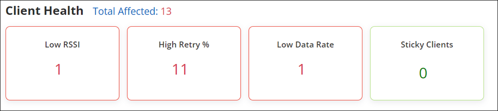
The Client Health widget lists the following:
- Total Affected
- Some clients could have more than one issue — for example, both Low RSSI and Low Data Rate. Such clients would then appear in both categories. CV-CUE ensures that such clients are not counted twice and shows the total number of distinct clients affected by the issues listed below in the Total Affected field .
- Low RSSI
- The number of clients that are below the set RSSI threshold value.
- Low Data Rate
- The number of clients that are below the set data rate value.
- High Retry %
- The number of clients that have the retry rate % more than 20%. Retry rate % is the number of retry packets divided by the total number of data packets of a client.
- Sticky Clients
-
The number of sticky clients present on the selected folder or floor.
A Sticky Client is a device that tends to stay associated with an access point, even when the signal strength is poor, rather than roaming to another Access point in the vicinity that might offer better signal strength.
Average Latencies
Average latencies shows the average latency time (response time) taken by servers like DHCP, DNS, AAA and Network servers with respect to the clients that are present on a selected folder or floor.
- DHCP
- DNS
- AAA
- Application
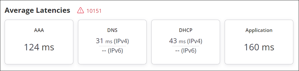
When you click on a latency, you can view the baseline graph for that latency.
Clients by Average Data Rate
Clients by Average Data Rate is a widget that displays the average data rate consumed by the clients on the selected folder or floor.
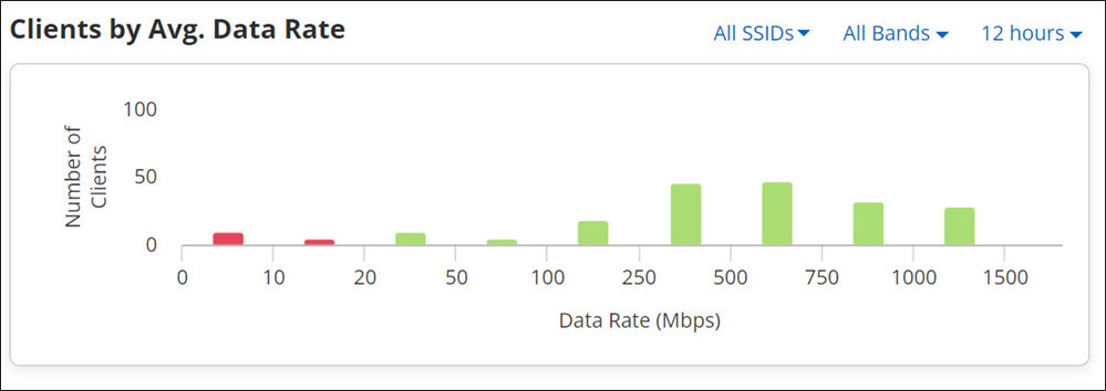
- The clients with data rate, below the set threshold value are in red.
- The clients with data rate above the set threshold value are in green.
- The clients that are in the bucket where the threshold value falls, are in yellow. For example, in the above image, a threshold value that is set as 75 Mbps, falls in the bucket of 50 Mbps to 100 Mbps. The clients that have threshold values between 50 Mbps and 100 Mbps are marked in yellow.
Refer to Set Threshold for a Folder or Floor for more information on how to set a threshold value.
The data on the widget can be filtered using the available filters on the top right corner of the widget. To know more about the filters refer to Filters on Widgets.
Clients by RSSI
Clients by RSSI is a widget that displays the average RSSI (dBm) of the clients on the selected folder or floor.
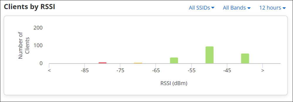
- The clients with RSSI, below the set threshold value are in red.
- The clients with RSSI above the set threshold value are in green.
- The clients that are in the bucket where the threshold value falls, are in yellow. For example, in the above image, a threshold value that is set as -60 dBm, falls in the bucket of -65 dBm to -55 dBm. The clients that have threshold values between -65 dBm and -55 dBm are marked in yellow.
Refer to Set Threshold for a Folder or Floor for more information on how to set a threshold value.
Clients with Most Traffic
Clients with Most Traffic widget displays a bar chart showing clients with highest data usage. The data shown is for clients on the selected folder or floor.
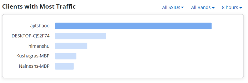
The data on the widget can be filtered using the available filters on the top right corner of the widget. To know more about the filters refer to Filters on Widgets.
Top Locations Affected by Poor Performance
The widget displays a horizontal bar graph depicting the top five locations and their clients, that are affected by poor performance of Wi-Fi network. The graph contains the data for the selected parent and its immediate child folders.
- Low RSSI
- Low Data Rate
- High Retry %
- Sticky Clients
Top 5 locations with poor performance issues, on the selected folder or floor is listed in a decreasing order.
If you hover the mouse over the bar in the chart, the tool-tip displays the number of clients affected by poor performance with respect to the total number of clients on that location. When you click on a bar you are redirected to a page that lists all the clients that are affected by poor performance. For example, if you click the Low RSSI value, you will be redirected to a page that lists all the clients with low RSSI values and their relevant details at that location.
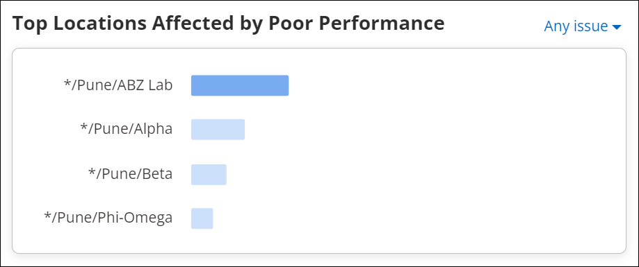
The data on the widget can be filtered using the available filters on the top right corner of the widget. To know more about the filters, refer to Filters on Widgets.
Network Usage
You can access the Network Usage chart in two different ways from CV-CUE UI. If you access the chart from the performance dashboard, it displays a line graph showing the number of clients associated with the SSID and its traffic volume, for all the clients on the selected folder or floor. Whereas when you access the chart through AP drill down, it displays similar data, but this time for the selected AP.
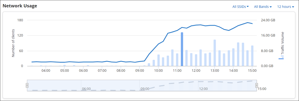
You can view or retrieve data using the filters. To know more about these filters refer to Filters on Widgets.
The data of the network usage chart can be filtered based on two parameters: a client's data and the amount of data used by an application.
Drill down on the data point on the graph, redirects you to the page containing client connections table. This table contains the list of all the client connections along with their detailed information for the selected timestamp. For client details, refer to Filtered Network Usage Chart.
- Client Connections table - contains the list of all the client connections along with their detailed information for the selected timestamp.
- Top Applications - that shows top ten applications with highest data usage. You can select an app from the drop-down list given on the top left corner of the table. Along with the selected application name it displays application specific data consumption.
- All Application traffic - it displays the total amount of data used by the applications for a selected Access Point or a location. This information is shown at the top-right corner of the table.
- Client Connections - selecting client connection displays the list of all the clients using the application selected from the top applications list.
- Access Points Distribution - selecting access points distribution displays the list of all the associated APs.
Set Data Rate and RSSI Threshold for Folder or Floor
Thresholds are global settings and can be configured only on the root folder. You must be a Superuser, Administrator, or Operator to set the thresholds. If you have the Viewer privileges, you can only view the thresholds. The same threshold values are applicable on all the folders and floors in the Navigator.
| Threshold Name | Values |
|---|---|
| Data Rate | 20 Mbps to 100 Mbps
For example, if the threshold value is 80, clients below the set Data Rate threshold will be classified as Low Data Rate clients. |
| RSSI | -45 dBm to -75 dBm
For example, if the threshold value is -60, the clients below the set RSSI threshold will be classified as Low RSSI clients |
- Go to .
- Ensure that you are in the correct folder or floor in the Location tree.
- Click Set Thresholds.
- On the Set Thresholds page, type the values for Low RSSI and Low Data Rate within the allowed range.
- Save the settings.
Applications Dashboard
The applications dashboard gives you the quality of experience of each monitored application. You get an overall view of top ten applications that have maximum traffic in your network. The baseline gives you an insight into the percentage of poor application experience over a period of time.
Application Experience
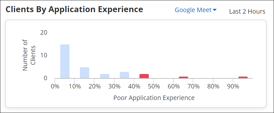
Navigate to Dashboard > Applications to view the Application Experience chart. You can monitor the performance of web-based enterprise applications (such as Email applications, HR and Project Management applications, Intranet, Online Drive, and others) along with VOIP-based applications such as Zoom, Hangouts, and others. Arista APs capture essential details of the TCP flows of a web application and send it to the server to determine the health of the application. If the overall health is calculated as poor, CV-CUE displays the percentage of application experience for the duration. A lower percentage indicates a poor application experience whereas a higher percentage indicates a good application experience.
- Web applications running on UDP are not supported for Web Quality of Experience (QoE).
- The algorithm only inspects information carried in the IP and TCP headers for each TCP stream that are related to the monitored applications. It does not inspect the user's data in the process.
- Only Wi-Fi 5 and higher APs support QoE monitoring of web-based applications.
By default, the most affected or most used applications are shown in a card view in the tab. If you have a preference for specific applications, you can also pin them to the Application Experience widget.
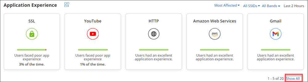
In each card, the red bar indicates the percentage of poor application experience, whereas the green bar indicates the percentage of good application experience. If we take the case of Google APIs and Youtube in the above image, the Google API users faced poor application experience 56% of the time, whereas the YouTube users faced poor application experience 30% of the time.
You can also view the application health for a specific SSID using the SSID filter (It is set to “All SSIDs” by default). Select All SSIDs to see a graph of the aggregated data for all SSIDs and all applications.
- 2.4 GHz
- 5 GHz
- 6 GHz
- All Bands
- Baseline - %Poor App Experience
- Application Traffic
- Application Traffic - Sessions
- Application Traffic - Clients
- Application Traffic - Quality of Experience
- Clients with Most Application Traffic
- Clients using this Application
Monitor Selected Applications
You can monitor a maximum of 25 applications for application experience, including TCP and VOIP-based applications.
- Go to tab. Ensure that you are at the root folder.
- On the Application Experience widget, click the Monitor Application Experience icon.
- On the Monitor Application Experience right panel, click Add to monitor the applications. You can add up to 25 applications for monitoring.
- Save the list of selected applications.
Monitor Custom Applications
Your organization may use applications that are not predefined in CV-CUE. You may want to monitor such applications for QoE. Add such applications as custom applications and monitor them from Dashboard.
- Go to tab. Ensure that you are at the root folder.
- On the Application Experience widget, click the Monitor Application Experience icon.
- On the Monitor Application Experience right panel, click Custom Applications.
- Provide the Application Name, IP address and port number used by the application. The application is added to the Monitor Application Experience right panel. Use the Plus icon to add multiple applications.
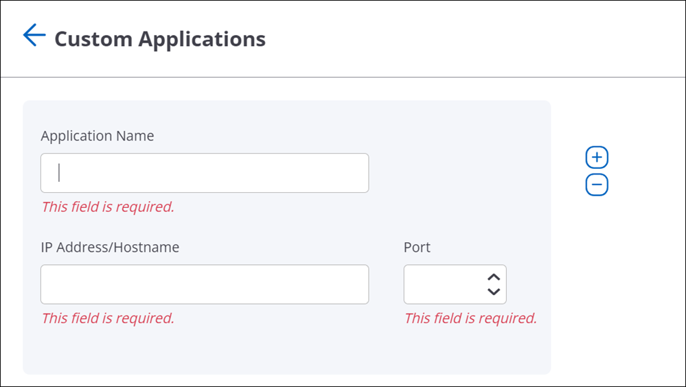
- Save the applications.
- On the Monitor Application Experience right panel, search the custom application and click Add.
View and Pin Applications on the Dashboard
On the landing page of Applications Dashboard, the Application Experience widget displays only 5 applications out of 25 in a card view. To see the card view of all 20 applications, click Show All.
You can choose which applications you want to view on the landing page by pinning your desired applications. To pin the applications on the Dashboard landing page for default view, click Show All in the Application Experience widget. Pin the application using the Pin button.
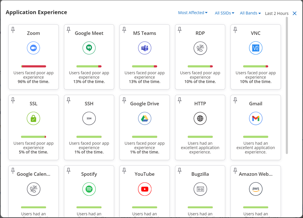
If you don't pin any applications, then CV-CUE displays the applications based on its usage or application experience. Use the Most Affected or Most Used filter to view the applications without pining them.
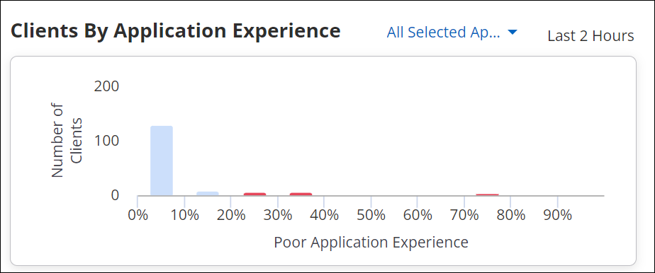
Clients by Application Experience Widget
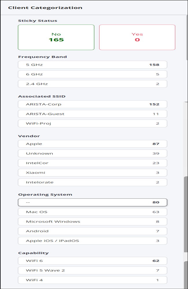
Logical Categorization of Clients and Failures
CV-CUE creates logical categories of clients, grouping them based on properties such as their band of operation (2.4, 5, or 6 GHz), OS type, etc. You can then drill-down from Client Journey and troubleshoot issues based on these client properties - for example, you can check if Association failures occurred for clients on a particular band. The grouping of clients into meaningful logical categories speeds up Root Cause Analysis (RCA) of client connectivity issues. You no longer need to spend time trying to extract patterns from a row-column grid of data.
- OS Type - The client operating system type, e.g., Android, iOS.
- Protocol / Band - The 802.11 protocols or bands the client is operating on, e.g., ax, ac, b/g.
- Manufacturer - The client manufacturer, e.g., Apple, Samsung.
- Sticky Status - Indicates if it is a sticky client, i.e., if it is connected to an AP even though it sees better signal strength from a neighboring AP.
Drill-Down by Logical Client Category
You can drill-down and analyze Client Connectivity and Performance issues by filtering on logical client categories. For example, you can view all Authentication failures for Windows 10 clients.
- Go to DASHBOARD > Connectivity>Client Journey.
- Select the stage in the client journey that you want to analyse. For example, to analyse Authentication failures, select Authentication.
You will see the list of clients that failed authentication,with filter tabs for the most prominent characteristics, i.e., logical groupings. For example, the following figure shows tabs for Associated SSID, Frequency Band, Operating System, and Capability.
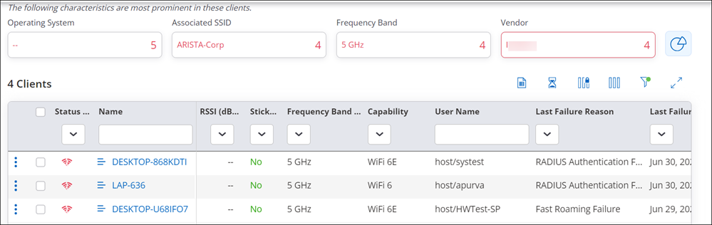
- Select the characteristic (for example, logical category) by which you want to filter the list of clients. For example, to see the list of clients with WiFi 6 Capability that failed authentication, click the Capability filter.
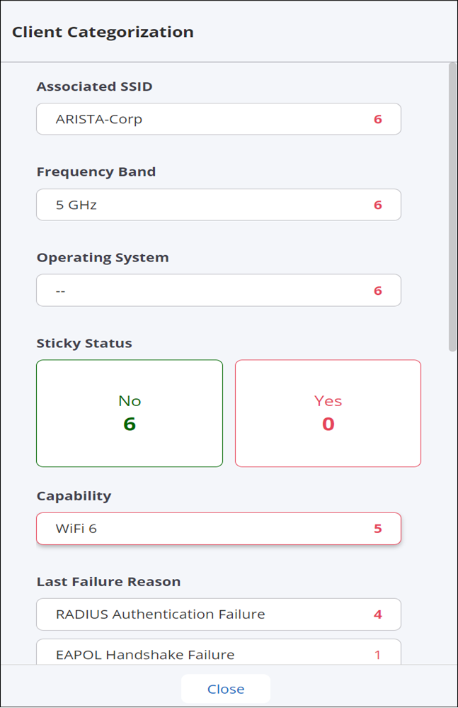
- You can see the distribution of clients across logical categories by selecting the pie chart to the right of the filter tabs.
A Distribution window pane opens up, containing client details grouped by logical categories such as Manufacturer, OS Type, etc. as shown below. You can then select a category from this window to filter the list of clients by that category.
Infrastructure Dashboard
The Infrastructure Dashboard provides an overview of the health of all managed Access Points (APs). This dashboard provides a real-time health snapshot of your access points, covering connectivity status, performance metrics, link speed, power delivery, RF noise, channel usage, and distribution.
Navigate to Dashboard > Infrastructure to view the Infrastructure Dashboard.
Infrastructure Dashboard charts consider the CPU Utilization and Memory Utilization of all the APs present at a server to calculate the average CPU Utilization and Memory Utilization based on the different selected criteria. The average is used as the threshold to point out the APs that have higher than average CPU and Memory Utilization.
Note: You must have Aeris enabled on your server to leverage this feature.
With the Infrastructure Dashboard, network administrators can get the health check of all the APs installed at a particular location. In the event of network failure, network administrators can use the dashboard to isolate Access Points exhibiting anomalous behavior and accelerate troubleshooting. The Infrastructure Dashboard also allows network administrators to take preventive and corrective actions based on the health insights. It helps them identify APs that have high CPU or memory utilization. By proactively flagging these spikes, the Infrastructure dashboard helps prevent unexpected reboots, system panics, and the resulting network downtime.
Infrastructure Dashboard consists of the following charts:
Counters
Summary counters highlighting APs with connectivity or performance issues. You can click the counter tile to view the list of affected Access Points.
Connectivity Counters
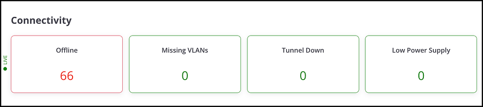
- Offline:Number of Access Points that are currently offline or unreachable. Click the counter tile to view the list of inactive Access Points.
- Missing VLANs: Number of Access Points with one or more VLANs not configured.
- Tunnel Down:Number of Access Points with one or more tunnels in a down state.
- Low Power Supply:Number of Access Points operating in low power mode.
Performance Counters
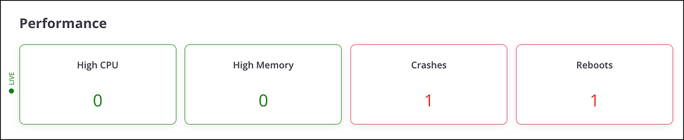
- High CPU Utilization: Number of Access Points with CPU utilization greater than 80%.
- High Memory Utilization: Number of Access Points with memory utilization greater than 80%.
- Crashes: Number of Access Points that experienced one or more crashes within the last 24 hours.
- Reboots: Number of Access Points that rebooted within the last 24 hours.
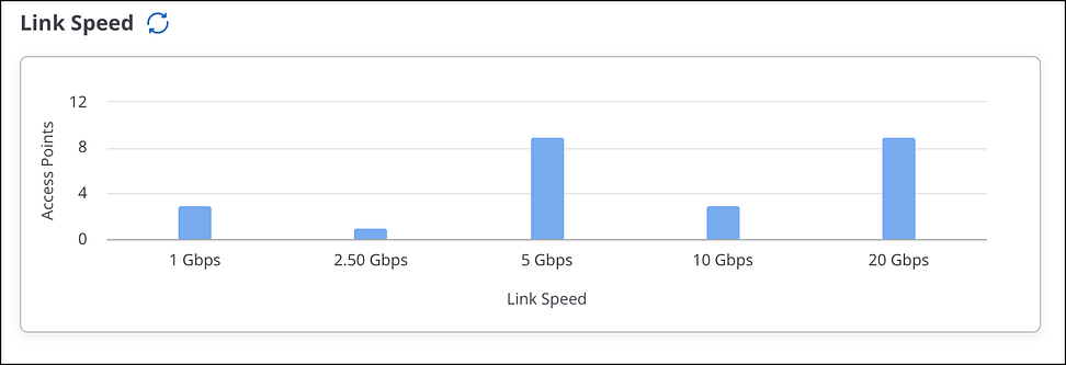
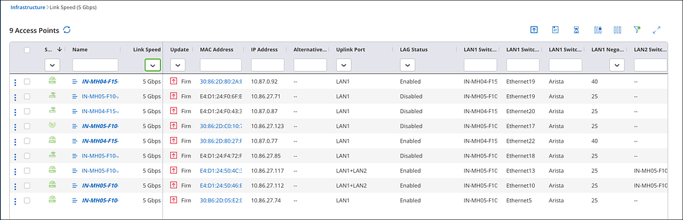
Link Speed
Displays the link speed of Access Points at the selected location. Users can click on any bar to view the list of Access Points operating at that link speed.
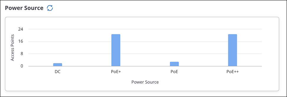
Power Source
Displays the power source used by Access Points at the selected location.
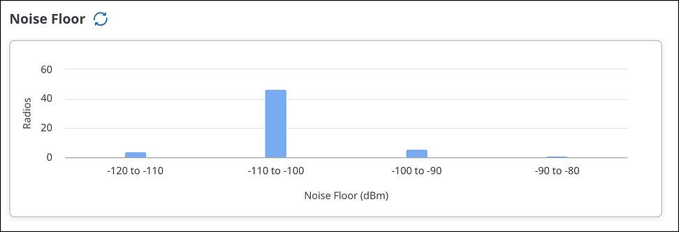
Noise Floor
Indicates the background signal level created by the combined effect of all noise sources and unwanted signals within the measurement environment.
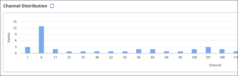
Channel Distribution
Shows how Access Points are spread across available wireless channels.
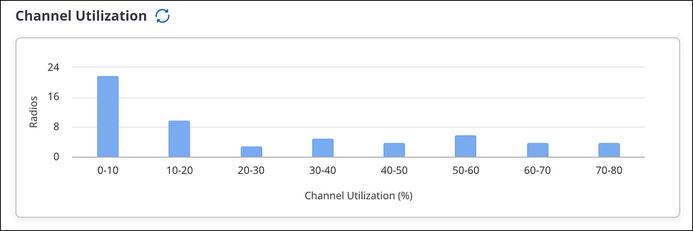
Channel Utilization
Displays the percentage of channel utilization reported by Access Point radios at the selected location.
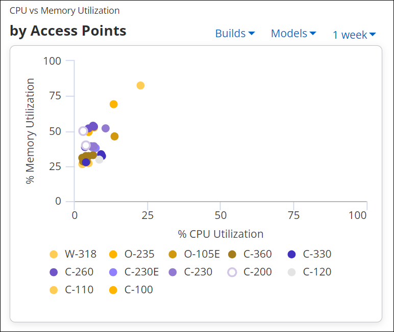
CPU VS Memory Utilization by Access Point
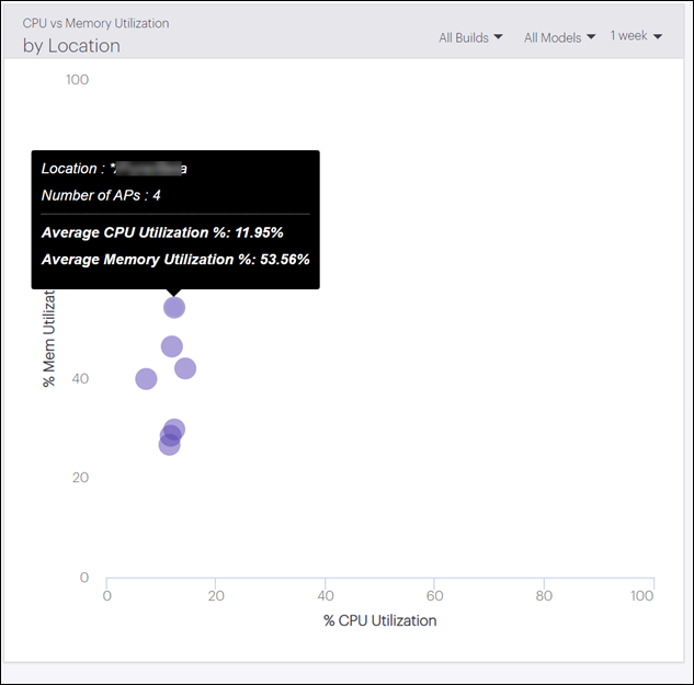
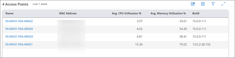
CPU VS Memory Utilization by Location
Access Points by CPU Utilization
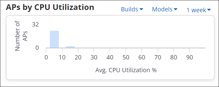
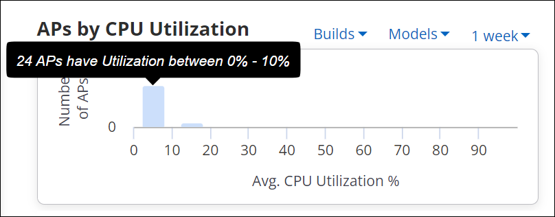
A yellow bar denotes APs having utilization more than the threshold. The threshold is calculated by the following formula.
Threshold = (mean utilization of all the APs + standard deviation *2)
APs with utilization higher than the calculated threshold are marked with the yellow bar. And all the APs with utilization of more than 80% are marked with a red bar.
Access Points by Memory Utilization
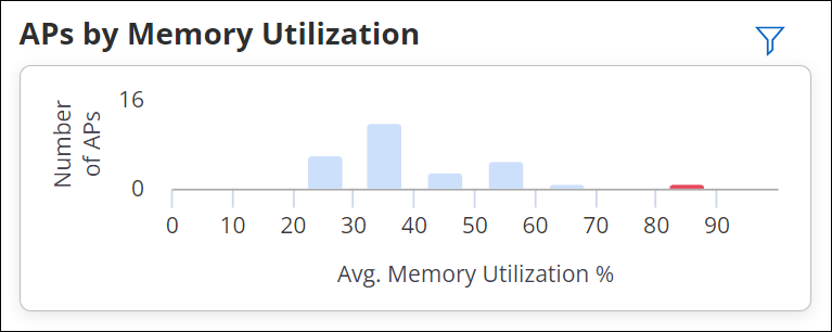
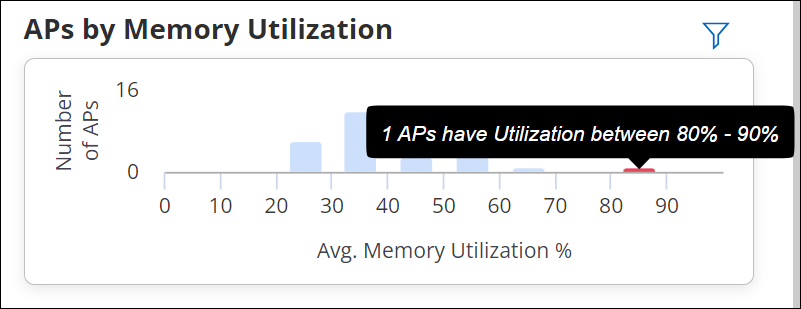
A yellow bar denotes APs having utilization more than the threshold. The threshold is calculated by the following formula.
Threshold = (mean utilization of all the APs + standard deviation *2)
APs with utilization higher than the calculated threshold are marked with the yellow bar. And all the APs with utilization of more than 80% are marked with red bar.
Trend Utilization
The Trend Utilization chart depicts the trend of average CPU and Memory Utilization of all APs installed at the selected location. The trend chart shows 25, 50, and 75 percentile utilization of the APs. The trend chart uses comparative data and not the absolute data to depict percentile utilization.
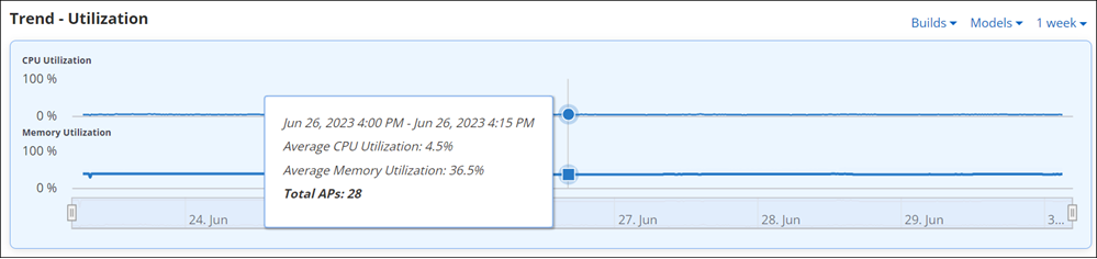
A change in the trend during a particular time duration can help administrators identify network issues or time frames when network congestion is highest.