Baselines
CV-CUE dynamically computes and updates a baseline for normal performance and connectivity of the network. The baseline adjusts as the network behavior changes, eliminating the false positive and false negative alerts associated with thresholds.
Baselines versus Thresholds
A baseline is used as a basis against which things are measured. Baselines have been traditionally used when you want to determine the effect of a change. For example, if you want to optimize your wireless network, you need to take a baseline of metrics such as retry rates or average data rates so that you can measure if the changes had a positive or negative impact.
A threshold is a level that must be exceeded to trigger an action. Thresholds are commonly used in network monitoring systems for alerts. For example, if a retry rate threshold were set at 50%, the system would trigger a warning when the retry rate exceeded 50%.
CV-CUE studies the behavior from the historical data of clients, APs and applications, automatically calculates a baseline. The baseline is calculated at an interval of 15 minutes. Any behavior that deviates significantly from the baseline is considered to be an anomaly and highlighted in the graph. In controller based network monitoring systems, thresholds are static and the same value gets applied globally. This creates problems for network admins because wireless network characteristics can be different in different environments.
Thresholds are good for monitoring information where there is a clear, non-arbitrary delineation between acceptable and not acceptable. Thresholds are static. They do not adjust to changing conditions. Wireless networks are dynamic and change over time. The normal level of retry rates may be very different today and a month from now. Clients change, environments change, applications change, and usage changes rapidly. A static threshold is a challenge because it does not adapt to what is normal for the network. Then, if some metric regularly crosses its static threshold, the network admin is bombarded with irrelevant warnings. The network admin must then go in and reset the threshold. The problem lies in determining what the correct threshold is. If the threshold is set low, there will be too many alarms as to cause alarm fatigue. This is dangerous because valid alarms are lost in the sea of unimportant, false positive alarms. To counter alarm fatigue, many network admins set the threshold too high. This is dangerous because valid problems (false negatives) do not trigger action.
How to Read a Baseline Graph?
CV-CUE takes the idea of the baseline and makes it dynamic. Dynamic baselines determine what is normal for a network and adjust as network conditions change. For example, retry rates may be low when the Wi-Fi is first set up with only a few clients. Later, when many more clients are added to the Wi-Fi network, the retry rate may be very different. Dynamic baselines adjust as networks change. This avoids the problem of thresholds while allowing comparisons to the baseline to identify real problems.
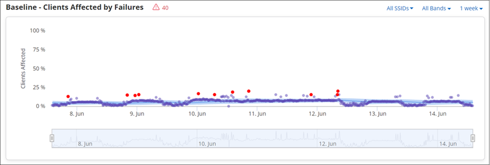
- Baseline - Blue line
- Deviation Range - the light blue shaded area around the baseline
- Observation points - Purple dots are an average of the data at 15 minute intervals
- Anomalies - Red dots are observation points that are well outside the norm
The Baseline Graph has a provision to filter data. You can zoom in and zoom out the graph to view the granularity in detail. The zoom feature is at the bottom of the graph.
CV-CUE Baselines
CV-CUE includes baselines for both connectivity and performance events. The table below lists the available baselines and where they can be found on the CV-CUE interface.
| Type | Baseline Chart | Per | Location on CV-CUE UI |
|---|---|---|---|
| Connectivity | Clients Affected by Failures | Location | DASHBOARD > Connectivity |
| AP | MONITOR > Access Points > AP Drill Down | ||
| Baseline - AAA Latency | Location | Dashboard > Performance > Avg. Latencies Chart > AAA Drill Down | |
| Baseline - DHCP Latency | Location | Dashboard > Performance > Avg. Latencies Chart > DHCP Drill Down | |
| Baseline - DNS Latency | Location | Dashboard > Performance > Avg. Latencies Chart > DNS Drill Down | |
| Performance | Data Rate | Client | MONITOR > Clients > Clients Drill Down |
| RSSI | Client | MONITOR > Clients >Clients Drill Down | |
| Retry Rate % | AP | MONITOR > Access Points > AP Drill Down | |
| Client Affected by Poor Performance | Location | Dashboard > Performance | |
| AP | MONITOR > Access Points > AP Drill Down | ||
| Clients Affected by Poor App Experience | AP | MONITOR > Access Points > AP Drill Down | |
| Clients Affected | Location | Dashboard > Applications | |
| % Poor Application Experience | Location | Dashboard > Applications | |
| Baseline - Application Latency | Location | Dashboard > Performance > Avg. Latencies Chart > Application Drill Down |
Example 1: Baseline - Clients Affected by Failures (AP Based)
The chart provides a baseline for the clients affected by connection failures for the selected AP.
The data points are determined by the total number of connected clients and the last connectivity state of clients in a 15-minute interval. When you hover on the data point it provides a tooltip. The tooltip contains the consolidated information in the percentage that indicates the good and bad experience of the clients along with the calculated baseline for the given point of time. Click the data point on the graph to retrieve the detailed information.
Example 2: Baseline - Data Rate
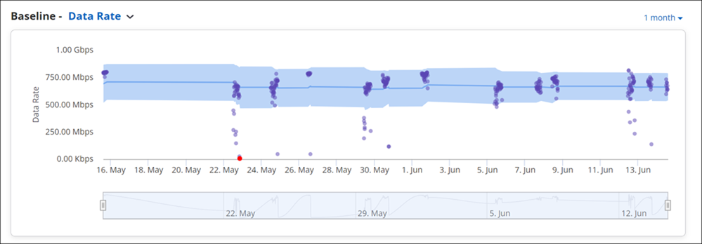
The graph displays the calculated baseline of the average data rate consumed by an individual client. The anomalies are calculated by comparing the data rate against the globally configurable threshold. Because acceptable data rates vary for each network or environment, CV-CUE uses a threshold to detect anomalies. The baseline and deviation band are still calculated, but anomalies are determined by the data rate threshold.
Data Reporting and Retention
Client connection success and failure with root cause analysis are reported by the AP to Arista Cloud almost immediately after it occurs. Performance and other data are aggregated and reported every 15 minutes.
| Data Type | AP Reporting Interval | Cloud Storage Duration |
|---|---|---|
| Client Connection Attempts | Immediately | 1 month |
| AAA, DHCP, DNS. & TCP Latencies | Soon after detection | 1 month |
| Client Application Data | 15 minutes | 1 month |
| Client Performance Metrics | 15 minutes | 1 month |
| BSSID Performance Metrics | 15 minutes | 1 month |
| SSID Application Data | 15 minutes | 1 month |
| Baseline Data | 15 minutes | 1 month |
Data Point Drill Down
The below table contains the attributes specifying the detailed info about the connected clients. The info is available in the tabular format on data point drill down from any baseline chart. The attributes with no specific name of a baseline chart are common for all the charts.
| Option | Description |
|---|---|
| Name | Name of the client. |
| User Name | User name of the client. |
| MAC Address | A unique 48-bit IEEE format address of the client assigned to the network adapter by the manufacturer. |
| Last Failure Time(Available for Baseline - Clients affected by failure) | The latest date and time when the client failed to connect to the network. |
| Associated SSID | SSID of the WLAN to which the client is connected. |
| Associated Access Point | The AP with which a client is associated. This is the AP through which the client communicates with other clients and devices on the network. |
| Location | Location of the client. |
| IP Address | IP address of the client. |
| Protocol | Indicates the 802.11 protocol used. |
| Channel | Operating channel of the AP to which the client attempted to connect |
| OS | Name of operating system running on the client. |
| Average RSSI(dBm) | The observed RSSI (Received Signal Strength Indicator) value for the client. |
| Up/Down Since | The latest date and time since when the client is up or down. |
| Connected/Disconnected Since (Available for Baseline - Clients Affected by Poor Performance graphs) | |
| First Detected At | The date and time when the client was first detected. |
| Role | The role assigned to the client on associating with an SSID. |
| Google Authorized | A boolean value indicating whether the client is in the authorized list of clients imported through Google Integration. |
| Vendor Name | Indicates the vendor name. |
| Uplink Data (Available for Baseline - Clients Affected by Poor Performance graphs) | The amount of data transferred by the client. |
| Downlink Data (Available for Baseline - Clients Affected by Poor Performance graphs) | The amount of data received by the client. |
| Retry Rate (Not available for Baseline - Clients affected by failure) | The retry rate in percentage. |
| Sticky (Not available for Baseline - Clients affected by failure) | A boolean value indicating if the client is a "sticky client", i.e., if it is connected to an AP even though it sees better signal strength from a neighboring AP. |
| Application Name (Available for Baseline - Poor Application Experience) | Name of an application. |
| Application Usage Time (Available for Baseline - Poor Application Experience) | The time duration for which a client has accessed an application. |
| Poor Application Experience (Available for Baseline - Poor Application Experience) | The poor application usage experience for a client connection. |
| Uplink Bitrate (Available for Baseline - Poor Application Experience) | The rate at which the client transmits data (in bits). |
| Downlink Bitrate (Available for Baseline - Poor Application Experience) | The rate at which the client receives data (in bits). |
| Downlink Jitter (Available for Baseline - Poor Application Experience) | Variation in the delay of packets received by a client. It is used to measure the quality of VoIP applications. |
| Uplink Jitter (Available for Baseline - Poor Application Experience) | Variation in the delay of packets transferred by a client. It is used to measure the quality of VoIP applications. |